Accéder au contenu principal

All

Scanahand 7 released

News

Scanahand 7 released - January 8, 2020

We've just released Scanahand 7. It includes several powerful and awesome improvements, which allow you to generate amazing fonts! Scanahand makes it easy to create fonts from your handwriting. This brand new version can optionally add kerning to your fonts and allows you to generate custom templates based on existing fonts. Scanahand 7 comes with improved support for high-resolution monitors and is available in both 32-bit and 64-bit versions.

Scanahand Product Details

Download Scanahand

FontCreator 13 released

News

FontCreator 13 released - March 18, 2020

We've just released FontCreator 13, coming with several improvements and new features that will help you build awesome fonts.

The most impressive improvements are:

  • Interactive proofing of OpenType layout features
  • Support for OpenType SVG color fonts
  • Improved Color Export options
  • Enhanced Anchor Manager
  • Improved Auto Attach
  • Improved Shaping Engine

OpenType Proofing

FontCreator has all the tools you need to create professional fonts, but it wasn't always easy to locate and fix potential problems in your OpenType layout features. That is why we've made the new interactive proofing tool.

You can read more about it here:

Font Proofing – OpenType Layout Features Unleashed

OpenType Color Fonts

The OpenType font format contains two scalable color font extensions, CPAL and SVG. FontCreator supports them both.

Layout Engine

The layout engine is responsible for the correct display of text, based on the available OpenType layout features. This allows our font editor to preview text similar to how it is seen in other software like Microsoft Word, Adobe InDesign, Serif Affinity Designer, and web browsers. We've made several improvements, so it is now perfect with most common scripts, and with some complex scripts like Arabic. We will continue to improve it, but with limited resources it would be great to know what specific improvements you would like to see in a future release.

Get it

You can download FontCreator 13 from our download page. Please use our forum to discuss the new features; enjoy!


FontCreator 14 released

News

FontCreator 14 released - June 23, 2021

We have just released FontCreator 14, coming with several improvements and new features that will help you build awesome fonts.

Variable Fonts

This new release of FontCreator fully supports variable fonts, offering you more flexibility to design and generate font families. Variable fonts are supported by all major web browsers and more and more desktop software adopt this technology. FontCreator is the only font editor that natively supports this technology, as it is fully integrated into the core of our software.

A variable font contains one or more axes (like weight or width) which allow a continuous range of style variations. In general, a variable font is a (subset) of a typeface, as it combines font styles into a single resource, but there is one catch. The outlines need to be compatible, otherwise variations cannot interpolate. FontCreator allows you to easily combine your existing non-variable fonts into a new variable font as it comes with tools to locate and fix compatibility issues.

Here is an online tutorial that should get you started: How to Make a Variable Font

FontCreator is a “what you see is what you get” font editor, so you can proof and test your fonts while making changes at the same time. The OpenType Designer comes with an interactive proofing tool, so you can instantly see how your input text is processed by our shaping engine, revealing all features and lookups that are applied. For most fonts this is sufficient, but no worries, as with one click you can test your font in external software and even in a web browser. Right out of the box; amazing!

Dockable Panels

For more than 20 years FontCreator used floating tool windows, but it was time to replace those with dockable panels. Our font manager MainType also makes use of these panels, so you are probably already familiar with this layout. This change also allowed us to add support for themes, so you can now switch to a dark theme. The comparison tool dialog has been replaced by a Text Tool feature within the Glyph panel. The good old Font Properties dialog is turned into a panel, which makes editing font properties more convenient.

Exchange Font Sources

With variable font support we also made sure FontCreator can import and export a Designspace document along with Unified Font Objects. This allows you to share your (variable) font projects with other font designers in case they use another font editor.

Other Improvements

The Glyph panel always allowed you to show a background image, which is useful if you want to trace an outline. In addition to this, it now also supports a mask, which is basically a vector-based background. It allows for even more precision when you want to refine your glyph outline. The OpenType Designer now has an option to show the anchor cloud while working on your mark-to-base, mark-to-ligature, or mark-to-mark lookups. We have even implemented Variable FEA Syntax for glyph positioning (as proposed by Simon Cozens).

Windows Only

We have heard rumors that some font designers use a Mac. Even though our software is made to run on Windows, there are ways to use it on a Mac.

Running FontCreator on a Mac

Get it

FontCreator 14 has all the tools that you need to create professional fonts, so what are you waiting for?

You can download FontCreator 14 from our download page. Please use our forum to discuss the new features; enjoy!

Our 25th Anniversary

News

We're celebrating 25 Years of High-Logic!

1 December 2022 is a very special birthday for High-Logic – we have turned 25!

High-Logic is proud to celebrate 25 years in business as an independent font software vendor. In 1997, software engineer and entrepreneur Erwin Denissen decided to create a font editor during his graduation project. Since Erwin had to pay his graduation supervisor himself, it is probably the first startup initiated by Fontys University.

The screenshot on the right shows FontCreator (aka the Font Creator Program) version 2 which was initially released in 1999.

FontCreator has always been the most popular font software, but over the years High-Logic has released several other products; MainType, a powerful font manager and Scanahand, a fast and easy font generator. Most professional font designers use more than one tool to edit and produce their typefaces, and over the years many of them have come to appreciate the way FontCreator helps them create better fonts.

High-Logic is the only font software vendor to have developed its own native font engine that includes an advanced shaping engine, OpenType layout feature compilers and decompilers, font validation tools, converters for both Unified Font Object (UFO) and DesignSpace formats, together with support for subsetting variable fonts (change default location, change axis range, and extrapolation).

Font Creator Program version 2.2

“Our proprietary font engine sets us apart from the competition,” says Erwin Denissen, “FontCreator exports fonts with the highest known compression and it is the only font editor that allows you to visually edit all OpenType layout features. We spend a lot of time on innovation and R&D, which upholds our company slogan”.

We have over 82,500 paid customers who have created over 550,000 fonts and counting. Of course, a celebration wouldn’t be a celebration without a big thank you to our loyal customers – so enjoy 10% off all products. Visit our store and use this discount coupon for FontCreator, MainType, and Scanahand at checkout: CPN4SPL1973

You can download our software from our download page; enjoy!

Scanahand 8 released

News

Scanahand 8 released - July 28, 2023

We've just released Scanahand 8.

It comes with improved generation of glyph outlines and numerous other awesome improvements, which allow you to generate amazing fonts!

Scanahand makes it easy to create fonts from your handwriting.

This brand new version can optionally add kerning to your fonts and allows you to generate custom templates based on existing fonts. Scanahand comes with improved support for high-resolution monitors and is available in both 32-bit and 64-bit versions.

FontCreator 15 released

News

FontCreator 15 released - August 31, 2023

We have just released FontCreator 15, coming with several improvements and new features that will help you build awesome fonts.

Hybrid Glyph Outlines

This new release of FontCreator allows you to make outlines with a mix of contours and components, so called hybrid outlines. This give you more freedom to design your outlines based on other glyphs, while added specific contours.

Support for the .glyphs file format

FontCreator already supported both Designspaces and Unified Font Objects, but we have made another huge step in interchangeable font project resources. If you happen to design fonts in a community, you will the trilled to know, FontCreator now allows you to exchange font files through the .glyphs file format.

Variable Fonts

If you are into variable fonts, you will love the improved detection and fixing of interpolation issues.

With variable fonts the outlines need to be compatible, otherwise variations cannot interpolate. Fortunately FontCreator comes with advanced tools to locate and fix compatibility issues.

You can now reorder variation axes if needed.

In case you haven't stepped into the variable world, here is an online tutorial that should get you started: How to Make a Variable Font

Other Improvements

FontCreator is a “what you see is what you get” font editor, so you can proof and test your fonts while making changes at the same time. The improved shaping engine along with the interactive proofing tool will help you design complex fonts with ease. For most fonts the tools that come with the font editor are sufficient, but no worries, as with one click you can test your font in external software and even in a web browser. Right out of the box; amazing!

We have redesigned Transform panel, so it is now more convenient to make changes.

Somehow we have managed to squeeze some more nodes out of the optimize contour feature. While improving the join (union, intersection, exclusion, and also cut/knife) contours feature, we have also added support for cubic curves.

Windows Only

We have heard rumors that some font designers use a Mac. Even though our software is made to run on Windows, there are ways to use it on a Mac.

Running FontCreator on a Mac

Since September 2024 FontCreator is available on both Windows and macOS

Get it

The new version of this amazing font editor has all the tools that you need to create professional fonts, so what are you waiting for?

You can download FontCreator 15 from our download page. Please use our forum to discuss the new features; enjoy!

FontCreator for macOS released

News

FontCreator for macOS released - September 5, 2024

We are thrilled to announce the release of FontCreator 15 for macOS!

FontCreator is Now Available on macOS!

FontCreator for Windows has been downloaded over 5 million times since 1997. After years of requests from Mac users who couldn’t find a font editor that matched FontCreator’s capabilities—especially for tasks like proofing—we are excited to announce that this popular font editor is now finally available for macOS. This powerful tool, trusted by professionals and accessible to users of all levels, lets you create and edit (variable) OpenType and web fonts with ease.

Key Features

  • Intuitive Interface: FontCreator is designed for everyone, from beginners to seasoned professionals.
  • Advanced Tools: Real-time font validation, an integrated shaping engine, a visual OpenType layout designer, and an interactive proofing tool.
  • Collaboration-Friendly: Supports ufo, designspace, and the .glyphs file format for seamless project interchangeability.
  • Powerful Editing: Design characters and glyphs, supporting both quadratic- and cubic-based contours, import images, edit fea feature code, and more.
  • Variable Fonts: Define axes, masters, and outline layers to create variable fonts.

FontCreator is a true native font editor, so there is no need to buy or install third-party tools or extensions.

FontCreator is a “what you see is what you get” font editor, so you can proof and test your fonts while making changes at the same time. The shaping engine along with the interactive proofing tool will help you design complex fonts with ease. With one click you can test your font in external software and even in a web browser. Right out of the box; amazing!

Get it

This amazing font editor has all the tools that you need to create professional fonts, so what are you waiting for?

You can download FontCreator 15 for macOS from our download page. You can find the Windows version there as well. Please use our forum to discuss the new features; enjoy!

Scanahand 9 released

News

Scanahand 9 released - April 24, 2025

We've just released Scanahand 9 — an easier, sharper, and more flexible way to turn your handwriting into a real font.

  • New Weight Conversion Setting – adjust the overall weight of your characters with a handy drop-down list.

  • Expanded Language Support – work with Scanahand’s interface in even more languages.

  • Improved Font Export – faster and more reliable creation of TTF/OTF/WOFF files.

Download Scanahand 9 today and start crafting beautiful fonts in minutes!

FontCreator 16 released

News

FontCreator 16 released - April 29, 2026

We've just released FontCreator 16, our biggest update in years. Version 16 brings a deeper layer model to the editor, a real subtractive design tool, parametric component reuse, and a refreshed editor surface unified across Windows and macOS. The Home, Standard, and Professional editions have been retired. There is now one FontCreator with all features included.

Mask

Any contour or component can now be flagged as a mask to subtract it from the geometry that precedes it. Compound shapes such as rings, donuts, and counter-style cut-outs, subtract as a single hole, and the original geometry is preserved in the project file. Masks are flattened automatically only on export. It's the design-time subtraction tool that the toolbox has been missing: build complex shapes constructively, without committing to destructive boolean operations.

FontCreator 16 glyph editor: a contour marked as a mask subtracts from the surrounding outline, producing a hole in the glyph shape.

Background Layer and Helper Layers

The background sitting behind every master is now a proper layer of its own, with its own outline, metrics, anchors, and color. Helper Layers join it as auxiliary layers — design references, alternate sketches, comparison overlays — attached to a master and listed alongside everything else in the new Masters and Layers panel.

Smart Components

Smart Components are component references with parameters. Define internal axes on a glyph — width, contrast, anything you need — carry alternate layers along them, and reuse the same component at different positions in different host glyphs. Round-trips cleanly through the FontCreator project format and .glyphs version 3.

FontCreator 16 glyph editor: a smart component with internal axes, instanced at different positions in different host glyphs to produce variations from a single source.

Path Decorations

Corner and cap components can now be attached to specific points on an outline. The decoration follows the point through edits, copy and paste, and round-trip with .glyphs. Combined with stroke expansion, this is everything you need to design ornamental, calligraphic, or technical typefaces from a small set of reusable parts.

Reference Artwork

Load any number of bitmap or vector reference images per master directly into the Masters and Layers panel as layers — sketches, scans, signatures, logos, anything you want to trace or compare against.

A Refreshed Editor

The Masters and Layers panel has been unified across Windows and macOS, with click-to-edit color swatches, a palette-entry picker on color rows, and consistent toolbar and context-menu actions. New visualisations — the Curvature Comb, Contour Direction Indicators, Marquee Zoom — and a Shift constraint on the Pen tool round out the editor surface.

There's much more in this release; the complete changelog has the full list.

Windows and macOS

Since September 2024 FontCreator has been available on both Windows and macOS, and every feature in version 16 ships on both platforms.

Licensing

FontCreator 16 ships with a single edition, the Home, Standard, and Professional editions have been retired. One license now includes every feature on Windows and macOS, available as a perpetual license or as an annual subscription. See the buy now page for current pricing, or the upgrades page if you're an existing customer.

Get it

The new version of this amazing font editor has all the tools that you need to create professional fonts, so what are you waiting for?

You can download FontCreator 16 from our download page. Please use our forum to discuss the new features; enjoy!

Font Inspection

FontCreator Tutorials

Font Inspection

written by Erwin Denissen, published January 31, 2019

As soon as you start adding OpenType features to your fonts, it is very important to keep an oversight of how they all work together. Fortunately, FontCreator has several powerful tools that allow you to test your font, so you can detect errors easily.

The first quick test to perform is checking characters with diacritics in the preview toolbar. In this case we have taken a closer look at Cambria, testing several Latin lowercase letters with diacritics.

Within the font character grid select a group of characters to inspect. Press the “p” key on the keyboard to use them within the preview window. The font has advanced, anchor-based, positioning features for diacritics, which we want to inspect. Therefore we enable these features: ccmp, mark, and mkmk.

As you can see, there are two glyphs that seem to misbehave, so we want to track down those issues within the OpenType features. First we copy the line of text (containing the characters that we are inspecting: ṙṛṝṟṡṣṥṧṩṫṭṯṱ) from the upper right of the preview toolbar to the clipboard.

Then we open the OpenType Designer. At the bottom of the dialog, do ensure that you have checked the box on the left for “_shaper.” This will ensure that the lookups are processed in the same way that other shaping engines would process them. The shaper is not perfect, but it works great for Latin, as you can see below.

Now copy the line of text from the clipboard. To jump quickly to the possibly invalid item, we first click the macron, but that doesn’t trigger anything, which looks suspicious. Since clicking the macron failed, we now click the letter r itself, which then causes the upper part of the dialog to jump to the glyph composition / decomposition (ccmp) feature.

Bingo! You can see the multiple substitution lookup contains rdotbelowmacron, which uses a modifier macron while it should have been the combining mark named macroncomb. The glyph named uni1E69 has a similar issue, as it uses dotaccent instead of dotaccentcomb.

We can easily fix the issues by changing the output field for these items. “r dotbelowcomb macroncomb” and “s dotbelowcomb dotaccentcomb” do the trick.

Now that we have fixed the OpenType layout features, we still see an issue with “Latin small letter s with dot below and dot above.” The composite lacks a dot below, which can easily be fixed. You can either make the glyph empty and then use complete composites to regenerate it, or add the missing diacritic. To add the dot below mark, just double-click the glyph to open a Glyph Edit window. Then right-click and select Add. You can then select a character; use the filter at the bottom of this dialog to quickly find “dotbelowcomb.”

Scanahand 6.1 released

News

Scanahand 6.1 released - December 10, 2018

We've just released Scanahand 6.1. The web font export now supports both WOFF version 1 and 2. You can now decide which font to use for displaying the header cell text. And it comes with several other enhancements and improvements.

Scanahand Product Details

Download Scanahand

Font Family Settings

FontCreator Tutorials

Font Family Settings for Proper Style Linking

written by Erwin Denissen, published December 8, 2018

Windows comes with several font families (typefaces) that are made up with more than 4 fonts, so such family comes with more than just Regular, Italic, Bold, and Bold Italic. To name a few; Calibri contains 6 fonts, Segoe UI comes with 12 fonts and Sitka is king with 24 fonts. The trick to make this work is fairly straightforward; however you need to be consistent. All fonts within the family must have the same Typographic Family. However the four common fonts (Regular, Italic, Bold, and Bold Italic) leave the Typographic Family and Typographic Subfamily empty, and instead will use the Font Family and Font Subfamily fields. The other fonts will be grouped together based on their Width and Weight, and will get their own Font Family name based on that. Older software (including Microsoft Office on Windows) supports the combination of Font Family and Font Subfamily, while modern software (including Adobe Illustrator and Microsoft Office on Mac) uses Typographic Family and Typographic Subfamily. For example a typeface named "GreatFace" with 10 fonts:

In FontCreator all these settings and flags can be modified through the settings on the Font Properties dialog. Identification tab: Font Family Font Subfamily Width Weight Bold checkbox Italic checkbox Italic Angle Some versions of Windows and Word automatically add fake bold to any font with weight set lower than 250, e.g. Thin or Extra-light (Ultra-light), so better avoid these weights.

Extended tab: Typographic Family Typographic Subfamily If the Typographic Family and Typographic Subfamily fields are empty, the values from Font Family and Font Subfamily are used.

Characteristics tab: PANOSE Weight PANOSE Proportion

FontCreator Tutorials

FontCreator Product Details

Download FontCreator

Latin Diacritical Marks - Accents

FontCreator Tutorials

Latin Diacritical Marks – Accents

This article was originally published November 28, 2018. Updated August 20, 2022.

A diacritic is a mark used to create composite characters. These diacritical marks mostly appear above or below a letter, but they can also be within a base character, and even between two letters. Diacritics are used in several scripts for different reasons. In Latin they are mainly used to provide pronunciation guidance. Some of these marks are also known as accents (e.g. acute, grave, circumflex, and tilde).

Base characters have an advance width as they define the horizontal space used to show the outline. Marks are usually non-spacing, as they just belong to the base character without changing the space occupied by the combination. In left-to-right scripts (like Latin) such nonspacing combining marks are usually placed before the left side bearing (thus the glyph has a negative LSB), in order to combine with the preceding letter.

Precomposed Characters

At some point in designing a font you probably want to add precomposed characters (e.g. like Ccedilla, aacute, and edieresis). A pre-composed character is actually a combination of a base character and one or more mark characters which also has its own Unicode code-point. From a historical point of view, they were added to Unicode to ensure the standard did support conversion  to and from other encoding standards which already included such precomposed characters.

FontCreator (standard and professional edition) allows you to automatically add and generate such characters through the Insert Characters and Complete Composites features. You can also use the Glyph Transform feature which allows you to quickly add support for Eastern Europe, Greek Extended, and more. Obviously they work best after you have designed the base and mark characters.

Precomposed characters are not equal to composite glyphs, but they go along very well. A composite glyph relates to the way a glyph’s outline is stored within a font, as composite glyphs are made out of “soft links” to one or more other glyphs. The benefit of composite glyphs, is that when you make modifications to the base or mark glyph(s), the composite is automatically updated as well.

There are text processing engines (Illustrator?) that decompose precomposed characters, but it seems most text processing engines (Windows, Microsoft applications, Firefox, etc) perform Unicode normalization form C (canonical composition) to the character string. This will transform each base character plus combining mark character(s), to the canonical precomposed equivalent (if available in the font). For example, a + ◌̃ becomes ã, but only if ã is defined in the font.

If the font lacks support for a pre-composed character, it will just show the base and the mark(s) they way they are designed. In such case a mark might fit perfectly above the e and o but the mark might be too much to the right on a w and way too low on capital characters.

If you directly type a precomposed character that is not available in the font, either another font is used to display it, or you'll see the missing glyph (.notdef). So it remains important to include precomposed characters.

Many languages make use of base and mark combinations that are not available as precomposed characters in Unicode (for example g + ◌̃ -> g̃ and G + ◌̃ -> G̃ as used in Paraguayan Guarani language). And as stated earlier, including precomposed characters to Unicode was more or less a legacy mechanism, the Unicode consortium has no intentions to add more of them. Fortunately people can type them as a base character followed by the combining mark character(s). But as noted earlier the marks won't always be positioned correctly this way. So how can we fix that?

OpenType Positioning Features

With OpenType font technology there is another way to position diacritics to base characters by using OpenType positioning features. The specific features are mark to base (mark) and mark to mark (mkmk). The mark feature positions mark glyphs in relation to a base (or a ligature) glyph. The mkmk feature positions mark glyphs in relation to another mark glyph, so you can stack them. Both these features make use of attachment points, also known as anchors.

Within FontCreator we can easily add OpenType feature code through the OpenType Designer. It can be done visually, or by writing feature code.

###
# OpenType Layout feature definitions
# Format: OpenType Feature File Specification version 1.25.1
# Generated by: FontCreator

languagesystem DFLT dflt;

@marks = [dieresiscomb gravecomb acutecomb circumflexcomb caroncomb ringcomb tildecomb macroncomb];
@basetop = [A-C a-c];
@basemiddle = [D O d o];
@basebottom = [C c];

markClass cedillacomb <anchor -256 0> @bottom;

markClass strokeshortcomb <anchor -385 727> @middle;

markClass gravecomb <anchor -24 1038> @top;
markClass acutecomb <anchor -339 1038> @top;
markClass circumflexcomb <anchor -324 1038> @top;
markClass tildecomb <anchor -367 1038> @top;
markClass macroncomb <anchor -415 1038> @top;
markClass dieresiscomb <anchor -357 1038> @top;
markClass ringcomb <anchor -295 1038> @top;
markClass caroncomb <anchor -324 1038> @top;

feature mark { # Mark Positioning
    lookup MarkToBaseBottom { # GPOS lookup type MarkToBase
        pos base C <anchor 658 0> mark @bottom;
        pos base c <anchor 529 0> mark @bottom;
    } MarkToBaseBottom;

    lookup MarkToBaseMiddle { # GPOS lookup type MarkToBase
        pos base D <anchor 366 727> mark @middle;
        pos base O <anchor 661 727> mark @middle;
        pos base d <anchor 733 1269> mark @middle;
        pos base o <anchor 558 519> mark @middle;
    } MarkToBaseMiddle;

    lookup MarkToBaseTop { # GPOS lookup type MarkToBase
        pos base A <anchor 663 1454> mark @top;
        pos base B <anchor 652 1454> mark @top;
        pos base C <anchor 658 1454> mark @top;
        pos base a <anchor 540 1038> mark @top;
        pos base b <anchor 262 1454> mark @top;
        pos base c <anchor 549 1038> mark @top;
    } MarkToBaseTop;
} mark;

Writing such code is tedious, but can be useful. But you don't need it if you want anchor based features, as FontCreator can do all the hard work for you!

OpenType Feature Generation

The fastest way to add anchor based features to your font, is to automatically generate anchors and the use them to automatically generate the OpenType layout features. Your font needs combining marks. If your font misses them, you can add them by running the Eastern Europe transform script. If your font lacks anchors, just select all glyphs and select Complete Composites -> Anchor Based Reposition to add and position anchors for several Latin based characters.

In general for diacritic marks placed above a base glyph, base anchors are vertically positioned at the CapHeight for upper case and at the x-Height for lower case characters. Anchors for regular marks are vertically positioned at x-Height, with some exceptions like "k", and "t". For diacritic marks below a glyph (like dotbelow and cedilla), the anchor will be set at the baseline.


Altering the vertical position of the anchors is not recommended, it is far more convenient to move the outlines of your marks up or down. Holding down the SHIFT key while moving the anchor in the glyph edit window limits the movement to either horizontal or vertical. Or it's position can be set using the Anchors toolwindow.

Now go to the OpenType Designer, and click the tool bar item in the upper left corner, within this dialog, select Anchor Based Positioning, and click the OK button.

The OpenType features and lookups are now added to your font as shown above. You can type preview text to test your features. You can either type a letter or a slash followed by the glyph name of the letter.

Vietnamese Stacking Accents

If the font contains combined Vietnamese tone marks, ensure those glyphs use the correct glyph name convention. For example, if you've created a glyph which consist of circumflexcomb and gravecomb, then name that glyph circumflexcomb_gravecomb.

Diacritics to the Max

If you want to use different marks for upper case and lower case letters, do add a mark variant with a .case suffix (e.g. gravecomb.case), and vertically position its top anchor at CapHeight. The .case diacritics should be positioned correctly for uppercase glyphs, which will usually be well above the CapHeight.

Some diacritics are too wide to fit with narrow glyphs like i and j, and may collide with adjacent glyphs. If this causes difficulty with the legibility of the text, add a mark variant with a .narrow suffix for these exceptions.

A font with small capitals and/or petite capitals, might benefit from additional variant marks. For small capitals, use .smcp; for petite capitals, use .pcap. If you want to use marks for both small capitals and petite capitals, only add marks with a .cap suffix.

If you stick to the above naming conventions, the OpenType feature generator knows how to include the correct features and lookups for anchor based positioning.

After you've added variant marks, be sure to reapply Complete Composites -> Anchor Based Reposition to the affected composite glyphs.

Automatically Reposition Glyph Members

By default changes made to anchors are not propagated to the composites, so you need to reapply Complete Composites -> Anchor Based for these changes as well. This can be cumbersome, and you might even forget to manually do this after each change. To be sure your composites always are in sync with the anchors you can set the composite glyphs to Auto Attach, as available from the context menu.

Updated July 20, 2019 - added text about Vietnamese Stacking Accents

Updated August 20, 2022 - replaced OTLFD feature code by Adobe fea syntax

Localized Forms – Turkish i

FontCreator Tutorials

Localized Forms – Turkish i

written by Erwin Denissen, published June 5, 2019

If your font supports Turkish and also contains OpenType features that make use of the dotted i and idotless, like small capitals and petite capitals, be sure to add localized forms for Turkish i, as there is something unusual with the Turkish alphabet. Like numerous other languages it is based on Latin script, but instead of 2 types of i, namely a lowercase i with dot and an uppercase dotless I, it contains four types. This creates an issue as the default case rules no longer apply. If you capitalize i it becomes I, but not with Turkish text, as then the i becomes İ and ı becomes I.

The regular small capitals and petite capitals features don’t take these rules into account, and will change the regular lower case i into a capital dotless I, thus fail for Turkish. In this case localized forms can be used to fix this language specific issue.

Add Localized Forms Feature for Turkish i

You can easily add the localized forms feature to your fonts with FontCreator. First ensure that you have an additional glyph named i.dotaccent which is a copy of the regular i. Your font already contains this glyph if you’ve used the tranform script named Unmapped Latin Small Capitals. If not, run the glyph tranform script, or manually add the missing glyph through the Insert Glyphs dialog. Provide this glyph formula within the By Name text area:

i.dotaccent=i

If your font contains petite capitals as well, add that variant too.

Next, go to the OpenType Designer and click the toolbar item in the upper left corner. Ensure that the Common Localized Forms option is checked along with other features you want, like Small Capitals and Petite Capitals, and click the OK button to generate the OpenType layout features.

The OpenType features and lookups are now added to your font as shown above. As there are several more languages (Azerbaijani, Crimean Tatar, Kazakh, and Tatar), which suffer from the same issue, those also include the same fix, so no need to worry about that.

You can type preview text to test your features. You can either type a letter or a slash followed by the glyph name of the letter. You can even add newlines and override OpenType layout feature settings as we did to show the difference between regular text and small capitals.

İzin kız iktisadî /newline/otsettings+smcp+c2sc İzin kız iktisadî

Note that Turkish also supports i circumflex, which is hardly used nowadays and won’t cause issues as the uppercase of î is Î, just like in other Latin based languages.

Feedback

Your feedback, suggestions for improvements, and questions related to this and other tutorials are welcome; please post them to the High-Logic Font Forum.

Localized Forms – Romanian Comma Accent

FontCreator Tutorials

Localized Forms – Romanian Comma Accent

written by Erwin Denissen, published June 5, 2019

The Romanian language uses S/s and T/t with a commaaccent. Due to legacy, and despite the recommendation to migrate from cedilla to comma, a lot of Romanian texts and some fonts incorrectly use S/s and T/t cedilla. This feature substitutes the commaaccent variants for both Romanian and Moldavian languages.

The regular small capitals and petite capitals features don’t take these rules into account, and will change the regular lower case i into a capital dotless I, thus fail for Turkish. In this case localized forms can be used to fix this language-specific issue.

Add Localized Forms Feature for Romanian Comma Accent

You can easily add the localized forms feature to your fonts with FontCreator. First ensure that your font contains the required characters. Your font already contains them if you’ve used the tranform script named Eastern Europe. If not, run the glyph tranform script, or manually add the missing glyphs through the Insert Glyphs dialog.

Scedilla, scedilla, Tcedilla, tcedilla, Scommaaccent, scommaaccent, Tcommaaccent, tcommaaccent


Next, go to the OpenType Designer and click the toolbar item in the upper left corner. Ensure that the Common Localized Forms option is checked.

The OpenType features and lookups are now added to your font as shown above. The Moldavian dialect is one of several dialects of the Romanian language, which suffers from the same issue, hence it is also taken care of.

You can type preview text to test your features. Be sure you've selected Latin script and Romanian language and enabled the _shaper or the locl feature. You can either type a letter or a slash followed by the glyph name of the letter.

/Scedilla/scedilla/Tcedilla/tcedilla şapte cunoştiinţă

Feedback

Your feedback, suggestions for improvements, and questions related to this and other tutorials are welcome; please post them to the High-Logic Font Forum.

Localized Forms – Catalan Punt Volat

FontCreator Tutorials

Localized Forms – Catalan Punt Volat

written by Erwin Denissen, published June 5, 2019

In Catalan there are words like lletres and estrella that use a “double L”, but there are also words which contain two Ls that each belong to a separate syllable, for example col·legi. In that case a “punt volat” (flying point) is used between two Ls. That point should be centered between the two stems of the Ls, preferably without adding additional space between the two Ls. However by just typing L followed by a “period centered” and another L will add the width of the “period centered”, which is not good.

This tutorial explains how to add a locl feature that adds a contextual lookup that replaces “L periodcentered” with Lmiddledot if followed with another “L”.

Add Localized Forms Feature for Catalan Punt Volat

You can easily add the localized forms feature to your fonts with FontCreator. First ensure that your font contains the required characters.

L, l, periodcentered, Lmiddledot, lmiddledot

If these glyphs are missing, you can add them through the Insert Glyphs dialog. If your font also contains Small Capitals and/or Petite Captials, do ensure it has variants for those as well.

Next, go to the OpenType Designer and click the toolbar item in the upper left corner. Ensure that the Common Localized Forms option is checked.

The OpenType features and lookups are now added to your font as shown above.

You can type preview text to test your features. Be sure you've selected Latin script and Catalan language and enabled the _shaper or the locl feature. You can either type a letter or a slash followed by the glyph name of the letter.

INSTAL·LACIONS paral·lel col·legi il·luminats

Feedback

Your feedback, suggestions for improvements, and questions related to this and other tutorials are welcome; please post them to the High-Logic Font Forum.

Font Metrics – Vertical Line Spacing

FontCreator Tutorials

Font Metrics – Vertical Line Spacing

This article was originally published June 12, 2019. Updated December 3, 2022.

At some point in designing a font (preferably at an early stage) you might be confronted with the limited space above and below characters. For example, it can be challenging to add support for Vietnamese as it has numerous capital letters with two diacritical marks above. Using special stacking combining marks helps, nevertheless it is important to set correct spacing metrics in your font.

Word processors, page layout software, e-readers, game engines, web browsers, PDF producers, and printer drivers don’t use the same mechanism to determine the line spacing. This tutorial provides information and examples, that show what font metrics work best for your font. We also discuss how easy it is to define these values with FontCreator, but the advice in this tutorial is also applicable to other font editors.

Outdated and Incorrect Information

Over the years both OpenType specification and recommendations related to these metrics have changed, so there is a lot of outdated and incorrect information about this topic floating around on the Internet.

Spacing Metrics

Before the advent of OpenType, there were TrueType fonts solely for Windows, and Postscript fonts for Macintosh. OpenType was invented as a universal (cross-platform) vector-based font format, but it came with compatibility/legacy metrics with platform-specific behavior. That is why, within an OpenType font resource, there are three groups of spacing metrics: Typographic, Windows, and Macintosh.


Use Typo Metrics for Line Spacing

To overcome these compatibility issues, a new flag was introduced in the OpenType specification. If the font has enabled “Use typo metrics for line spacing”, which we highly recommend, all applications should use these cross-platform values to determine default line spacing.

If the font has set this flag “Use typo metrics for line spacing”, then Microsoft Word uses the Typographic values. Otherwise it uses WinAscent and WinDescent along with LineGap as default line spacing.

On Windows, text will be clipped above these used ascender and descender values, so ensure that all your glyph outlines are within the visual (non-clipping) zone.

More and more applications use the Typographic Spacing Metrics values, but mainly legacy software still uses either Windows or Macintosh specific metrics. For consistent line spacing without clipping, we recommend the following approach.

Typographic (OS/2 -> Typo Ascender, Typo Descender, and Typo Line Gap)

Typo Ascender and Typo Descender should at least sum to “units per em” (upem). Take the maximum and minimum vertical outline positions from all glyphs that cover the primary languages your font supports. Usually an extended Latin character set, for example Unicode blocks Basic Latin along with Latin-1 Supplement, will do. Then proportionally increase the values so that they total upem.

Set the Typo Line Gap value between 7% and 25% of upem, so that the total of all three Typographic values makes a good default line spacing.

Windows (OS/2 -> Win Ascent and Win Descent)

WinAscent and WinDescent should accommodate the maximum and minimum vertical outline positions from all glyphs. Proportionally increase the values so that WinAscent - WinDecent is at least equal to TypoAscender - TypoDescender + TypoLineGap.

Macintosh (hhea -> Ascender, Descender, and Line Gap)

These values represent the design intentions of the font's creator rather than any computed value, and individual glyphs may well exceed the limits they represent. Some applications (mainly Mac based) use or used these metrics.

Simply set these to match the corresponding Typographic Spacing Metrics values.

How to Calculate the Values?

Now that you better understand how to set vertical spacing values, it is still not easy to manually calculate all these values. Fortunately, FontCreator has a button that does all the magic for you:

Adjust the line gap values to your liking and ensure you agree with the calculated values. Test the font on Windows, Macintosh, Web browsers, and applications like Microsoft Word, and Adobe InDesign.

Font Families

Use the same values for style linked typefaces (e.g. regular, italic, bold, and bold italic fonts), so that the document layout won’t reflow when changing the font style.

Remaining Issues and Thoughts

Some fonts (for complex scripts) might contain base characters and combining marks that when used together can exceed the calculated limits. In such cases you should consider increasing the spacing metrics.

Other requirements apply for CJK (Chinese, Japanese, and Korean) fonts that are intended to be used for vertical layout.

You may find it impossible to get a good balance between consistent layout across different applications and aesthetic spacing. If the outlines are too small or too large, you should consider increasing or reducing the size of your glyph outlines. We consider outlines too small if the CapHeight is less than ½ upem, and it is too large if is exceeds ¾ upem.

Feedback

Your feedback, suggestions for improvements, and questions related to this and other tutorials are welcome; please post them to the High-Logic Font Forum.

Updated December 3, 2022 - updated text and screenshots to reflect changes in current version of FontCreator

FmsConfig

MainType Tutorials

FmsConfig – Create and Restore Backups

written by Erwin Denissen, published July 3, 2019

Font Management Service Configuration Utility (FmsConfig)

The FmsConfig utility comes with MainType, and allows you to make and restore backups. You can find it in Windows start menu, but for your convenience you can also access it through MainType's main menu (Tools -> Create and Restore Backups).

Database, Vault, and Cache

MainType uses a database, like all professional font managers, so most of the information about a font such as font name, number of characters, version, foundry, and tags are stored in a database.

MainType also makes use of a vault. The vault is a database, that contains a copy of each font you add to the library. This ensures that you'll be able to install and load your fonts, even if you no longer have a copy on disk.

When you load a font, MainType might store a copy in the cache folder so your other software (Microsoft Word, Adobe InDesign, etc) can make use of it. MainType will automatically remove these copies as soon as they are no longer needed.

High-Logic Font Management Service (FontService)

MainType comes with a font service that runs in the background. It is a vital part of the font manager, as it keeps track of all available fonts, manages all your font operations, like installing, loading, and uninstalling fonts, and it is connected to the database, vault, and cache.

You will need to stop the font service if you want to make a backup, restore a backup, or want to move the database, vault, or cache to another location.

Backup and Restore

The use of a database and vault makes our font manager fast and robust. It also makes it convenient to make a backup.

In order to make a backup, start the FmsConfig utility. On the Status tab, click the Stop button to stop the FontService. Go to the Backup & Restore tab to click the Create Backup button. We recommend to make backups regularly; preferably not on the same hard disk.

When the backup process is completed, go back to the Status tab, and click the Start button to restart the FontService. To manage your fonts, start MainType through Windows Start Menu, or if available through the shortcut on your desktop.

Move Database, Vault, and Cache

You can see the locations used to store the database, vault, and cache through the Settings tab.

Tip: if you use a secondary hard disk to store software and documents, you might want to move your font database to that disk.

Feedback

Your feedback, suggestions for improvements, and questions related to this and other tutorials are welcome; please post them to the High-Logic Font Forum.

Plugins

MainType Tutorials

Plugins

written by Erwin Denissen, published July 5, 2019

Previous versions of our font manager came with plug-ins for Adobe InDesign. Only customers who (do most of their) work in Adobe InDesign benefit from the plugins, so most users never used them.Unfortunately we had to develop new plug-ins for every new release of InDesign, and on top of that some people reported instability issues due to the plug-ins. Based on customer feedback, we know competing font managers also face issues with their plug-ins; we all have to build upon the Adobe InDesign SDK.Since our font manager is one of the best and most stable font managers, we've decided to stop providing the plugins. We spend way too many time on updates and trying to improve the plug-ins, while most people never use them.There are other ways to manage fonts per project, and this approach works for all projects, no matter if you design documents in Adobe InDesign, Photoshop, Illustrator, Serif Affinity Designer, or even Microsoft Word. You can assign tags to your fonts, naming them according to the project you're working on. However, this is not recommended, as tags are meant to identify fonts, not projects.

The best solution is font groups. In MainType you can easily create a group for each client or project. When you decide to use a specific font in the document, just add it to the group. The next time you start working on the project, you can select the group, and click the Install group button to ensure that all fonts are available.

Feedback Your feedback, suggestions for improvements, and questions related to this and other tutorials are welcome; please post them to the High-Logic Font Forum.

MainType Tutorials

MainType Product Details

Download MainType

Arabic Font Design

FontCreator Tutorials

Arabic Font Design

written by Erwin Denissen, published March 17, 2020

This tutorial is aimed at FontCreator, but it provides a lot of information that can be used with other font editors. FontCreator, like any other font editor, is mainly used to design Latin based fonts, but our font editor also comes with advanced tools required for the development of Arabic fonts, covering Arabic, Farsi, Malay, Sindhi, Uighur, and Urdu. The OpenType Designer along with our native shaping engine and interactive OpenType layout proofing allow you to create, edit, and test complex script fonts.

Contextual Forms

Since most Arabic characters connect, the visual appearance depends on the character context. In general letters have four contextual forms:

  • isolated
  • initial
  • medial
  • final

In a non-joining context, the isolated form is used. The initial form is used as starter of a joined group of letters, the last letter uses the final form, and all characters in between use a medial character form.

Since most Arabic letters come in all four forms, there are a lot of characters and glyphs needed. Fortunately, numerous glyphs can make use of outlines from other glyphs, and FontCreator can help generate them using composite glyphs and anchors.

We will now create a new font, Arabic Starter.

The new font comes with over 200 (mostly Latin) characters. Usually you want to keep those, but to keep things simple, we remove all but the first two and manually add some Arabic letters.

FontCreator uses smart glyph naming, so if you know the names, you can quickly add them to your font. We use the Insert Glyphs window to add teh-arab, which is the isolated form. Since we want it to make use of other glyphs, we add those as well. Ensure Ranges is not checked, as that would conflict with glyph names that contain hyphens.

dotlessbeh-arab
twodotsabove-arab
teh-arab = dotlessbeh-arab + twodotsabove-arab

We now add outlines to the glyphs. Click the Free Draw icon to quickly draw an outline. There are other ways to make and refine it, but for this tutorial we do it the easy way.

When you are satisfied with the result, click the Convert to contours button. You might want to change the right side-bearing by clicking and dragging the right-most vertical dotted line. While we are still in the Glyph Edit window, we open the Anchor Manager (available from the Font menu) and add a new anchor class named top-arab. This class can now be used to define top anchor marks to position marks on base glyphs.

Still within the Glyph Edit window, we right-click above the dotlessbeh-arab outline and select Add Anchor… to add a Base anchor.

You can now click and move the anchor to reposition it to your liking, and when satisfied close this glyph edit window.

Within the font overview window double-click glyph twodotsabove-arab to edit it in a Glyph Edit window and use Free Draw to make the outline.

This glyph will be used as a mark, so right-click slightly below the outline to add a mark anchor. Since other marks can be placed on top of this mark, we also add a base anchor above the outline. So you end up with both a base and a mark anchor.

You can now close this window, and if all went well, you should be pleased with the result so far, as teh-arab is now also completed!

This is a great start, and it allows us to add the other character forms for teh-arab. Once again we go to the Insert Glyphs window.  We first insert the dotless variants as those will be used to make the character forms:

dotlessbeh-arab.init
dotlessbeh-arab.medi
dotlessbeh-arab.fina
teh-arab.init = dotlessbeh-arab.init + twodotsabove-arab
teh-arab.medi = dotlessbeh-arab.medi + twodotsabove-arab
teh-arab.fina = dotlessbeh-arab.fina + twodotsabove-arab

Now add outlines to the first three (the dotlessbeh forms) and don’t forget to add base anchors to them.

To be continued soon...

Font Proofing – OpenType Layout Features Unleashed

FontCreator Tutorials

Font Proofing – OpenType Layout Features Unleashed

written by Erwin Denissen, published March 17, 2020

Professional font designers know that the internals of an OpenType font can become very complex, especially when it contains numerous OpenType layout features. Glyph substitutions and glyph positioning are often required with international and high-end typographic fonts, to ensure layout engines correctly render text.

A font with a couple of substitution tables along with a single class based kern lookup is fairly easy to maintain, but when your font supports complex scripts like Arabic, it soon becomes next to impossible to keep oversight of all features and lookups that work together.

Microsoft VOLT

In the good old days, people had to use Microsoft VOLT (Visual OpenType Layout Tool) to add OpenType layout features to a font. It had to be used in conjunction with a font editor, as VOLT is not a full-fledged font editor. It contains a basic proofing tool, that allows you to step through features and lookups. You had to compile and install the font to test it. Two decades ago, this was all we got, so we accepted its limitations.

Advanced OpenType Proofing

FontCreator combines the power of an advanced font editor along with a visual OpenType designer. It also allows you to edit the feature code, and it can even import fonts with VOLT production data. With FontCreator 13 we’ve added an interactive proofing tool, which allows you to focus on the specific features and lookups that need your attention. It relies on our custom shaping engine, which currently supports numerous scripts.

To use the proofing tool, open the OpenType Designer window, and click the second toolbar icon in the upper left corner. Here you see the same font, but now in FontCreator.

It uses the preview text and selected script, language, and features as defined in the OpenType Designer window, but the proofing window allows you to see exactly what features, lookups, and specific items have been applied to turn your original input into the visual appearance as shown in the preview area.

Debug and inspect a line of text

To use the proofing tool to the max, ensure you use the internal shaping engine (_shaper) and provide the text you want to inspect in the text box above the text preview area.

Within the tree view, you can click an item, and it will be shown within the OpenType Designer window. This interactive proofing greatly speeds up the process of understanding how OpenType features work together.

To zoom into a specific part of the text, click and drag a rectangle within the Proofing preview area. This will enable the filter so only relevant OpenType layout features for the selection are shown.

As soon as you start using the proofing tool you’ll soon forget how much time you’ve wasted with manually writing down feature and lookup names in order to fix an issue in your OpenType features!

Create OpenType Color Fonts

FontCreator Tutorials

Create OpenType Color Fonts

(Originally published March 17, 2020 – last updated September 1, 2025)

Introduction

At first, the OpenType font format didn’t support multicolor fonts. That changed in 2013, when several vendors introduced their own solutions to meet the need for color emojis in operating systems, apps, and web browsers. I still remember attending the AtypI 2013 conference in Amsterdam, where it was officially announced that color would be added to the OpenType specification. At the time, there was no consensus on which format to adopt. The decision was made to let all of the major players involved — Microsoft, Apple, Google, Mozilla, and Adobe — each propose their own solution.

Back then, it was already clear to me this would fragment the landscape. In fact, in 2014 I wrote on the High-Logic forum that this would lead to a kind of “font color war” between competing formats. More than a decade later, we’re still living with the consequences: OpenType supports four different color extensions.

  • COLR/CPAL — Microsoft’s table-based system with layered glyphs and palettes.
  • SVG — Mozilla and Adobe’s proposal, embedding SVG graphics (optionally with CPAL).
  • CBDT/CBLC — Google’s bitmap-based format for color emoji in Chrome.
  • sbix — Apple’s raster image format (PNG, JPEG, etc.) for macOS, iOS, and iPadOS.

Of these, only COLR/CPAL and SVG are scalable vector-based formats. Both are supported in FontCreator, making them the most practical choices for type designers.

COLR/CPAL

COLR defines color glyphs as stacks of monochrome outlines, each painted in a palette color. Because it reuses standard outlines, it integrates seamlessly with variable fonts and keeps file sizes compact.

Strengths: lightweight, scalable, variable-font friendly.
Limits: COLRv0 has no gradients; COLRv1 (introduced later) adds gradients, transforms, and compositing.

Adding COLR in FontCreator

To make a layered multi-color glyph, you need to add other glyphs and then define a color for each of these color members. Unlike composite glyph members, you can’t change the size or position of these color members. You will need to make sure that the individual glyphs are all designed to fit into the color glyph.

    • Show the Members panel (Shift+F8) and the Palette panel (Shift+F2).
    • Switch to Color Mode in the Glyph Edit window.
    • Right-click → Add (or click the Add icon in the Members panel).
    • Select the members glyphs to include.
    • Use the Paint Bucket tool to assign palette colors.

    Implementation notes

    • Ensure the metrics (advance widths) match across the color glyph and the used glyph members.
    • Early COLR specs mandated that glyph index 1 be the .null glyph. This is no longer a requirement in the current specification.

    SVG

    The SVG extension embeds an SVG document per glyph. It enables richer graphics, including:

    • Clipping paths, gradients, stroke widths.
    • Opacity and filter effects.
    • Embedded raster images (PNG/JPEG via <image> elements).

    Only a restricted subset of SVG 1.1 is valid in fonts: <a>, <text>, and <font> are not allowed, and animation or interactivity should be avoided.

    Best practices:

    • Avoid <style> and viewBox, as some apps render them incorrectly.
    • Favor vectors; raster images inflate file size and don’t scale well.

    Adding SVG in FontCreator

    FontCreator doesn’t include a built-in SVG editor. You can:

    • Export SVG automatically from a COLR glyph, or
    • Import SVG graphics from an external editor. This gives maximum flexibility but can be tedious, since coordinate systems often need adjusting and external editors produce bloated markup.

    Color Palettes (CPAL)

    The CPAL table defines reusable color palettes:

    • The Foreground color links to the user’s chosen text color.
    • COLR: CPAL is required; currently most apps use only the first palette, though CSS font-palette will bring more control in browsers.
    • SVG: CPAL is optional and not widely implemented.

    Web Browser Color Font Support

    Web Browser Market Share COLR Support SVG Support
    Chrome 68% Yes
    Safari 17% Yes Yes
    Edge (Chromium-based) 5% Yes
    Firefox 3% Yes Yes
    Samsung Internet 2% Yes
    Opera 2% Yes
    Internet Explorer <1% Yes
    Notes:
    Market Share indication as of July 2025.
    Edge supported SVG from 2017, but not anymore since 2020, when it moved to Chromium. The Chromium project has no plans to add OT-SVG support.

    Software Color Font Support

    Software COLR/CPAL Support SVG Support
    Adobe Illustrator Yes (v29.3 / 2025+) Yes (CC 2018+)
    Adobe InDesign Yes (CC 2019+)
    Adobe Photoshop Yes (2025+) Yes (CC 2017+)
    QuarkXPress Yes (2018+, incl. COLRv1) Yes (2018+)
    Affinity Designer Yes
    Affinity Publisher Yes
    Sketch (macOS) COLRv0 Yes (macOS 10.14+)
    Microsoft Word (Windows 10/11) Yes Yes
    Microsoft PowerPoint (Windows 10/11) Yes Yes
    Microsoft Excel (Windows 10/11) Yes Yes
    LibreOffice Yes (6.3+) Partial
    paint.net (Windows) Yes
    CorelDRAW Graphics Suite Yes
    Figma
    Procreate (iPad) COLRv0 Yes
    Adobe After Effects / Premiere Pro Yes (2025+)
    Inkscape Partial
    Scribus Partial
    GIMP Partial
    Notes:
    COLR/CPAL is an outline-based color format (v0 = layered glyphs; v1 adds gradients, transforms, and compositing). No embedded bitmaps. Most native macOS apps that use CoreText support COLRv0. COLRv1 is not supported yet in CoreText.
    OpenType-SVG stores SVG documents and can include both vector shapes and embedded raster images (e.g., PNG/JPEG via the SVG <image> element), plus gradients/opacity/filters. OpenType uses SVG 1.1 with restrictions; feature support varies by app/OS. macOS generally requires 10.14+ for SVG font rendering. Large raster content can increase font size.

    Which Color Extension Should I Use?

    • For the web, COLR is the clear choice: compact, reliable, variable-font compatible, and universally supported in browsers.
    • For desktop publishing, it depends. While more and more software supports COLR, some still only recognize SVG. It may be best to provide both formats so end users can decide which one to use.

    Guidance:

    • If gradients are unnecessary, prefer COLR. You can then export to SVG for compatibility, ensuring both formats share the same outlines.
    • If gradients or complex rendering are essential, use COLRv1 where possible, or fall back to SVG.
    • Avoid packaging both COLR and SVG in one font; while technically allowed, it bloats the file and risks inconsistent rendering.

    Updated August 20, 2022 - updated color font support tables

    Updated September 25, 2024 - updated color font support tables

    Updated August 27, 2025 - updated color font support tables

    Updated September 1, 2025 - updated color font support tables

    Running FontCreator on a Mac

    FontCreator Tutorials

    Running FontCreator on a Mac

    written by Erwin Denissen, published March 17, 2020

    Update: FontCreator runs native on macOS!

    Since September 2024 FontCreator is available on both Windows and macOS, so this tutorial has become obsolete.

    Our first initiative to make a font editor started in 1996. At that time Apple had a hard time and Windows was booming. The software development environment used to make FontCreator is Windows only. Although Windows still dominates, many customers want to use our software on a Mac. Fortunately, there are plenty of options available to run FontCreator on a Mac; all require a Windows license. We will explain each one in detail:

    • Virtualisation
    • BootCamp
    • Portable (External Hard Drive or SSD)

    Virtualisation

    Virtualisation uses software to simulate the hardware of a conventional Windows PC. It allows you to run Windows within macOS itself. Thus you can run FontCreator side by side with Mac applications, without rebooting. Among other things, you can cut and paste text, and share files between them.

    You will need a program that runs as virtual machine, creates a partition on your Mac disk, whether HDD or SSD, and loads Windows on that partition. There are several such programs, like:

    Parallels Desktop (starting $79.99)
    VMWare Fusion (starting $89.99)
    VirtualBox (free for personal use)

    BootCamp

    Bootcamp is an Apple developed utility that allows you to run Windows. This utility is installed on every Mac. It creates a partition on the internal disk, downloads all the drivers from an Apple server to run all the interfaces of the Mac. On booting, press the Option key on the keyboard, and the Mac responds by showing a choice of two disks to boot from: one is Macintosh (the Mac) and the other is Windows. While running Windows, you won't be able to run Mac apps, so you really have to choose between Mac and Windows here.

    Portable

    This approach might be perfect for your needs if you don't want to use your internal disk. Obviously you need an external hard drive or SSD and install Windows on that. To do so, follow these steps:

    • Open Bootcamp Assistant from the Other Folder
    • Once launched do NOT hit Continue; instead select the menu Action from the ribbon menu
    • From there, select the submenu: Download Windows Support Software

    When you want to run Windows, just insert this drive on an USB input on the Mac and boot up. Windows will then launch as if it was a native machine. This makes all the resources of the Mac, memory etc. available to Windows. Being an SSD is extremely fast. Like with BootCamp, you won't be able to run Mac and Windows at the same time.

    Summary

    If you want to run FontCreator side by side with your mac applications, use Virtualisation. Otherwise use BootCamp or the Portable option.

    Let us know what choice you prefer, and how it worked out!

    Enrich Your Fonts with OpenType Features

    FontCreator Tutorials

    Enrich Your Fonts with OpenType Features

    written by Erwin Denissen, published March 22, 2020

    This tutorial is not about using fonts, but about how font designers can add gems like swashes, ligatures, and stylistic sets to their fonts. It is quite easy to accomplish, and it might add a boost to your font sales.

    A font can be so much more than just a bunch of characters. Nowadays all professional fonts come with OpenType layout features, and we will explain how to add several of the most common and popular features to your font:

    • Standard Ligatures
    • Stylistic Sets
    • Slashed Zero
    • Alternate Figures
    • Swashes
    • Contextual Alternates

    These features are all used to substitute one or more characters with a replacement. We will not discuss positioning features, as those are already taken care of in other tutorials. <TODO See spacing and kerning>.

    With FontCreator all, except for the contextual alternates, can be automatically added to your font. Just make sure you’ve added the extra glyphs and named them according to our glyph name convention.

    Within the OpenType Designer window click the first icon from the upper left corner to open the Generate and Update OpenType Features window. You will now be able to select which features you want to generate and/or update.

    Below we will provide the required glyph names per feature.

    Standard Ligatures (liga)

    Use this feature for combinations of letters that look better with a custom designed ligature, such as fi, fl and ffl. In general they improve the appearance of letters that otherwise would overlap. Applications know these ligatures should be used in normal conditions, but the user might disable the liga feature.

    FontCreator instructions: standard ligatures are detected automatically, so don’t worry about these. If you want to add additional ligatures, use the ligature name convention, along with a .liga suffix. If you want to add a ligature for the combination of these three characters, “f f b”, name it “f_f_b.liga”.

    Stylistic Sets (ss01-ss20)

    There are 20 features available for stylistic sets, they all allow for sets of stylistic variant glyphs corresponding to portions of the character set, e.g. you can provide closed alternatives for open letters.

    FontCreator instructions: give the glyph the name of the original character and add the corresponding suffix for the stylisitic set. So if you have a variant for letter “g” and you want it in stylistic set 4, name it “g.ss04”.

    Slashed Zero (zero)

    This one is easy to add, as it only requires a single additional glyph. It allows the end user to replace the default form of zero with an alternative form, which, for example, uses a diagonal slash through the counter to distinguish between 0 and O (zero and capital O).

    FontCreator instructions: give the slashed zero this name: “zero.zero”.

    Alternate Figures (onum, tnum)

    We highly recommend you add several variants of digits to your fonts, as end users might only use fonts that come with alternate figures. For financial and marketing research documents the tabular figures are most important, while for marketing brochures and advertisements, the old style figures might be more appropriate, as those are designed to look more like lowercase letters.

    FontCreator instructions: add “.onum” to all old style digits, e.g. “zero.onum”, and add “.tnum” to all tabular digits, e.g. “zero.tnum”, etc.

    Swashes (swsh)

    This feature allows the end user to replace default characters with corresponding decorative glyphs. You can provide more than one swash alternate for a given character.

    FontCreator instructions: add the “.swsh” suffix to all decorative glyphs.

    Contextual Alternates (calt)

    The last feature in this tutorial is more complex, as it allows you to add smart substitutions, which are based on what characters are before and/or after the character that is considered for replacement. E.g. you would make it use an alternative glyph for lower-case letter l, if it is preceded by another lower-case letter l.

    FontCreator instructions: It requires two manual steps:

    1. add a substitution lookup (name it mirror) and add one item: “l -> l.mirrored”.

    2. add a chained context substitution lookup to the contextual alternates feature and add this item to it: Backtrack “l”, Input “l”, and add substitution table “mirror” to it.

    Summary

    With FontCreator it is easy to add advanced OpenType layout features to your fonts.

    However, not all applications fully support all OpenType layout features, so test your fonts and provide accurate information to your customers about where they can use which OpenType features.

    Illustrator, InDesign, CorelDRAW, and Affinity Designer support all substitution features we've shown in this tutorial. Word 2010 and higher support almost all of them (no support for slashed zero and swashes yet), which are accessible by clicking Format → Font → Advanced:

    Let us know your results, we love to hear from you!

    Glyph Name Convention

    FontCreator Tutorials

    Glyph Name Convention

    written by Erwin Denissen, published March 24, 2020

    In the early years, it was a requirement to have glyph names stored within a font. There was a pre-defined list of names, but only for a selected list of Unicode codepoints. It was not a comprehensive list and since the names were mostly redundant information taking up space, nowadays most fonts are shipped without glyph names. During production, it is important to easily identify glyphs by their name, especially when you haven’t added outlines yet. Also, some glyphs look alike, or you’ve provided alternates. For this purpose, we are not bound to the glyph names used for release, instead, we use friendly names that are also used to automate things. The glyph names are not only used to generate automated OpenType layout features, but also in glyph metrics expressions, so it is important to give your glyphs proper names. Friendly Glyph Name Convention So FontCreator uses friendly names for all characters and glyphs which allows you to quickly identify them, but how should you name them? First, the friendly glyph names are case sensitive, so “adotbelow” and “Adotbelow” are two different names. We make a distinction between a character (mapped glyph) and unmapped glyphs. A character is a glyph with a Unicode codepoint. An unmapped glyph has no codepoint assigned to it, and thus is not a character. An unmapped glyph can still represent a character, but you are not able to access it directly within a word processing application. OpenType layout features allow you to access those unmapped glyphs, and that is where the name convention comes into play. Characters (mapped glyphs) starts with the actual friendly description of the character. If the character belongs to a non-Latin script, the abbreviation for the script (which starts with a hyphen) is added. Some examples:

    Friendly Name Code-point Script Unicode description Ccedilla $00C7 Latin LATIN CAPITAL LETTER C WITH CEDILLA Five $0035 - DIGIT FIVE A-cyrl $0410 Cyrillic CYRILLIC CAPITAL LETTER A fi $FB01 Latin LATIN SMALL LIGATURE FI zacute $017A Latin LATIN SMALL LETTER Z WITH ACUTE

    Unmapped glyphs have a name that leads back to the source character(s). There are two groups of unmapped glyphs: Ligatures Character Variant A ligature is a glyph that consist of several characters. The name for the ligature is the concatenation of the names of the glyphs that make up the ligature with an underscore between the individual glyph member names.

    Friendly Name Based On f_f_j f, f, and j z_gravecomb z and gravecomb

    A character variant is an alternate form of another character, glyph, or ligature. Do give it the same name as the mapped glyph and add a suffix that identifies how the glyph can be accessed through OpenType layout features. Examples:

    Friendly Name Based On Variant Ccedilla.ss01 Ccedilla Stylistic Set 01 five.sups five Superscript A-cyrl.pcap A-cyrl Petite Capitals zero.zero zero Slashed Zero sheen_yehhamzaabove-arab.fina sheen-arab and yehhamzaabove-arab Final Form

    If a glyph name is used in an OpenType script, it could cause issues with the parser if it contains specific characters. One of them is the hyphen which is both used to provide a script to the glyph name, but also to define a range of glyphs. In such a case, the glyph name comes between double quotation marks. Generate Glyph Names Generate Glyph Names (available through the main menu -> Tools -> Glyph Names -> Generate) will generate glyph names for all glyphs with a known code-point. It will also try to set names for glyphs that are used in the specified OpenType layout features. Glyph Names and Exporting Fonts If you wish to include glyph names in your generated fonts, it is best to select “Regenerate for release” in the Export Settings. This way you can provide friendly glyph names to be used for production only.

    FontCreator Tutorials

    FontCreator Product Details

    Download FontCreator

    Glyph Spacing and Optical Metrics

    FontCreator Tutorials

    Glyph Spacing and Optical Metrics

    written by Erwin Denissen, published March 24, 2020

    While designing your font you can add characters and glyphs without worrying too much about the metrics of each glyph, but before you consider adding kerning to your font, you must ensure that the spacing between glyphs is optimal.

    A font editor usually has several ways to adjust the side-bearings of each glyph, but FontCreator allows you to generate those metrics for your Latin characters with optical precision. Just open the Automatic Metrics wizard (available through the Tools -> AutoMetrics menu) and use the optical Metrics option to generate the best optical space before and after each character. You might need to try different Glyph spacing factors, which allow you to provide a global distance factor. A large factor will result in more spacing between glyphs.

    We’ve taken a couple of popular fonts, so that you can see the power of this feature. Below you see the original font (first line) along with the font after running Optical Metrics (second line). Both with font size 14. Kerning is not applied as that would override spacing.

    Sans Serif Fonts:

    Serif Fonts:

    With serif fonts, you see optical metrics finds it hard to calculate good values for glyphs with bowls, e.g. the combination “be”, “pe”, and “po”. We might need to investigate that to further improve the algorithm.

    Optical metrics took less than a minute per font. Not bad if you realize glyph spacing is considered as important as the design of the glyph outlines. Font designers can do without optical metrics, but they usually spent numerous hours trying to find a good balance. We don’t understand why other font editors don’t provide an automated feature for it yet, but for now, you can benefit from it while other font designers struggle with manual spacing.

    Perfect spacing between glyphs make a font stand out, and it avoids unnecessary kerning pairs.

    The Difference between TrueType and OpenType Fonts

    FontCreator Tutorials

    What's the Difference Between TrueType and OpenType Fonts?

    written by Erwin Denissen, published March 25, 2020

    More than half the world’s population uses fonts daily. Most people don’t care about the internals, but some want to know if there is a difference between TrueType and OpenType, or if they can decide what font is best based on the file extension.

    This article aims to debunk the myths and misinformation about font formats that circulate on the Internet. For example:

    Source Statement / Information Verdict
    356labs – OTF vs TTF? What's the difference? The fonts with a .ttf file extension are relatively older than OTF False
    MakeUseOf – OTF vs. TTF Fonts: Which Is Better? Makes you believe TrueType fonts are ttf and OpenType fonts are otf Misleading
         

    Let’s start with some relevant definitions and background information about scalable font technology:

    PostScript Type 1

    Adobe launched PostScript Type 1 in 1984. It became very popular among desktop publishers but is being phased out for over a decade.

    TrueType

    TrueType was invented by Apple in the late 1980s as a competition to Adobe’s PostScript Type 1. It is available since 1991 (Apple’s Macintosh System 7). Apple licensed TrueType to Microsoft for free and it became available on Microsoft Windows 3.1 in 1992.

    OpenType

    In 1994 Microsoft developed TrueType Open. It was further improved jointly by Microsoft and Adobe to become OpenType in 1996. It is an extension of the TrueType font format retaining its basic structure and adding many data structures to prescribe typographic behavior, such as ligatures, small caps, and old style figures, which allow font creators to design better international and high-end typographic fonts. While TrueType only allowed for TrueType outlines, OpenType also supports Compact Font Format based outlines (CFF is a variation of Type 1 fonts). OpenType solved many compatibility issues between Macintosh and Windows computers. Multiple Master support in OpenType has been discontinued as of version 1.3 of the specification, but since 2016 it supports font variations (see below).

    OpenType Font Collection

    An OpenType Font Collection (formerly known as TrueType Collection) is a means of delivering multiple OpenType font resources in a single file structure.

    OpenType Font Variations (also known as Variable Fonts)

    In 2016 support for font variations was added to the OpenType specification. It allows multiple font faces within a font family in a single font resource, thus for example thin, regular, bold, and heavy along with condensed and expanded can be included in a single font file, and additionally, it allows for continuous variation along the included design axes. The outline format can be either TrueType or CFF based, but for CFF based a new internal CFF2 table has been introduced for variable font support. Since this CFF2 table is not backwards compatible, most font designers make TrueType based variable fonts.

    Web Fonts

    The Web Open Font Format (both WOFF and WOFF2 versions) is a packaging format that encapsulates a TrueType font, OpenType font, OpenType font collection, or a Variable font. WOFF2 is basically equal to WOFF, but with better compression. Both are implemented in all major web browsers, although older web browsers might only support WOFF, or no web fonts at all.

    Do TrueType Fonts Still Exist?

    You can argue if OpenType fonts are all TrueType fonts containing additional data structures. We prefer to see OpenType as a new format, sure it is based on TrueType, but it is not the same.

    If you agree to this definition, then it is safe to say all modern computers mainly come with OpenType fonts. There are still numerous old fonts floating around the Internet that internally include only the data structures as defined in the original TrueType font specification, but it is best to avoid them as they no longer meet today’s design standards.

    If you want to keep using the term TrueType for all OpenType fonts, then what’s the use? It won’t clarify a thing.

    If you want to call fonts with TrueType based outlines TrueType, and the ones with CFF based outlines OpenType, then that is plain wrong. Don’t do it, instead read this article again.

    Font File Extensions – TTF versus OTF

    Both PostScript Type 1 and TrueType fonts are no longer made. All newly released fonts are OpenType fonts, period. But why do people still refer to ttf and otf?

    Probably because they think you can distinguish the internal outline format based on the font’s file extension. This is plain wrong, so let us explain it.

    Concerning glyph outline formats, OpenType fonts come in these flavours:

    1. OpenType with TrueType based outlines (quadratic Bézier curves)
    2. OpenType with CFF based outlines (cubic Bézier curves, like PostScript Type 1)
    3. OpenType with both TrueType and CFF based outlines (rare and not recommended)
    4. OpenType with only bitmaps of glyphs or with color glyphs (rare and not recommended, better use 1. or 2. along with bitmaps or color)

    Some 25 years ago Microsoft thought it would be wise, mainly for compatibility reasons, to continue to allow the original TrueType font file extension “ttf”, but only for OpenType fonts with TrueType based outlines. A new font file extensions “otf” was introduced and is allowed for both font flavors.

    Since a file that ends with .otf can be either an OpenType font with TrueType based outlines or an OpenType font with CFF based outlines, the file extension should not be used to differentiate between the above OpenType font flavours. Also note, that if you take an existing font and change the file extension from .otf to .ttf it will still behave the same, so the file extension means nothing!

    Here is what the official OpenType specification has to say about this:

    “In all cases, software must determine the kind of outlines present in a font not from the filename extension but from the contents of the file.”

    Text Layout and Rasterizer

    Font vendors usually provide several font resources to choose from. This make it hard to tell which one you should use. So, what is important?

    Rasterizers take the glyph outlines and output them on a device. How good the output looks mainly depends on the rasterizer, the outlines, font size, and optional hinting. Fonts usually look great on a high-resolution monitor and when printed but can look bad when viewed in an outdated web browser. So, what quality font and what outline format you need depends on your needs.

    OpenType Layout Features

    Another very important part of a font is the OpenType features, as those enable text-processing applications to improve text layout. Several of these advanced typesetting features are vital for complex script fonts like Arabic, while other features are used in desktop publishing and typesetting software like Adobe InDesign to activate specific character variants as available in the font. Not all software supports all OpenType layout features, so not all features are accessible in all software.

    Internal Font Tables

    Here is a technical summary of internal font tables that identify specific characteristics of fonts:

      Pure TrueType OpenType TT OpenType CFF  
    OS/2 version 0 or 1 (OS/2) Yes No No  
    OS/2 version 3+ (OS/2) No Yes Yes  
    TrueType based Outlines (glyf and loca) Yes Yes No  
    CFF based Outlines (CFF or CFF2) No No Yes  
    OpenType Features (BASE, GDEF, GPOS, GSUB, JSTF) No Optional Optional  
    Desktop File Extension .ttf .ttf or .otf .otf  
    Web File Extension n.a. .woff or .woff2 .woff or .woff2  

    As all this information is deeply buried inside the font resources, it is way more convenient to use a font manager like MainType:

    You can then ensure you are using the most recent version of your fonts that come with the most up-to-date OpenType layout features.

    Summary

    If people tell you to use OTF over TTF, they probably don’t know what they are talking about. If they refer to file extensions, or OpenType versus TrueType, or the internal outline format (TrueType based outlines versus Compact Font Format outlines), point them to this article, as that is not what OTF and TTF is about. If they want you to use fonts containing OpenType layout features, then they should talk about that.

    Pure TrueType fonts are legacy and should be avoided. We like to compare TrueType fonts with a square, and OpenType added an apex on top of it. With this new dimension it turned the square into a pyramid. Sure the base is still a square, but when you see a pyramid, would you call it a square?

    So, font file extensions mean nothing. You need to investigate the font internals to ensure what outline format is used and what OpenType layout features come with the font. We recommend using a font manager like MainType to inspect your fonts. When you have the option to choose between a font with TrueType based outlines and one with CFF based outlines, take the one with the best language support, and sufficient OpenType layout features. If you work with Word, it is wise to use OpenType fonts with TrueType based outlines, as those can be embedded in exported PDF documents.

    How to Make a Variable Font

    FontCreator Tutorials

    How to Make a Variable Font

    written by Erwin Denissen, published June 24, 2021

    The concept of variable fonts has been around for decades, but it is only since 2016 that this technology was adopted by the OpenType specification.

    A variable font is a single file, containing one or more axes (for example weight or width) which allow you to use a continuous range of style variations by means of interpolation. FontCreator allows you to export a variable font, but it can also be used to export all pre-defined styles (named instances) with a single click, so you can make fonts faster.

    This tutorial shows how to create a variable font out of two existing (non-variable) fonts.

    We assume you already made a Regular and Bold version of a font family. To get started do open them both in FontCreator.

    Weight Axis

    Since we combine two fonts with different weight, we need to add a Weight axis.

    Activate the Regular style (1) and open the Font Properties panel (2).

    From there, go to the Axes tab (3) and click the [+] toolbar icon and select Weight (4).

    Bold Master

    Within the Font Properties panel, select the Masters tab. Click the [+] toolbar icon and choose the Bold font. This will copy all glyph outlines from the Bold font into this one.

    Note: At this point you probably notice several glyphs in the Font Overview panel suddenly have a red background header. It indicates these glyphs have compatibility issues and as a result interpolation will fail. We will cover this later in this tutorial.

    We need to update the Axis Location for both masters. Select the Regular master and set the location to 400. For the Bold master set it to 700.

    At this point we already have a variable font. Well, done!

    First Impression

    In case you are curious about the results so far, so do we.

    To make use of the Weight Axis, we need to get access to the Variations panel. In case it is not visible yet, from the main menu, select View -> Panels, and then make sure Variations is checked. You can also use shortcut Ctrl+F7 to toggle the visibility of this panel.

    The Variations panel allows you to preview a location between your masters. Use the Weight slider, and you will see the outlines are automatically interpolated.

    There is one more panel we need to use, so let us bring in the Masters and Layers panel. If it is not visible yet, go to the main menu and select View -> Panels -> Masters and Layers. Shortcut Ctrl+F6 also works.

    This panel allows you to switch between the available masters. This is important, as the glyph outline layers are always located on a master. Thus, if you want to make adjustments to the Regular glyph outline, select that master.

    Test Web Font

    So playing with the Weight slider is pretty neat, but does it really work outside FontCreator?

    Let's see... From the main menu select Font -> Test Web Font (or press Ctrl+F5). This will export the variable font along with a web page, that is opened in your default web browser.

    Compatibility Issues

    As we mentioned earlier, interpolation can only work if the outline layers are compatible. So for each glyph, the outline layers must have the same number of contours. They also must be in the same order, and the number of points must also match. For composite glyphs the glyph members must match.

    In order to let FontCreator fix basic issues, we select all glyphs within the Font Overview panel, and then click the "Fix" toolbar button at the top of the Masters and Layers panel.

    Most likely there are still glyphs with issues. To fix those, we need to manually adjust the glyph outlines. Double-click a glyph to open it in a Glyph panel. The Masters and Layers panel will now show some hints about the kind of compatibility issues.

    To further assist in this process, we enable the Show compatibility issues toolbar button, also available on the Masters and Layers panel. This allows us to see what corrections we need to make. In the end all compatibility issues need to be resolved, otherwise your font ends up with glyphs that do not interpolate correctly.

    Named Instances

    To make the most out of your variable font, it should also contain instances. This way legacy software that lacks support for variation, can still use the named instances.

    We go to the Instances tab on the Font Properties panel. Here we update the axis location for the Default instance (400), and we add several more instances with weights 500, 600, and 700. We also provide unique Style Names.

    Although not required for the variable font, we also provide correct Weight Class and Width Class values. Those values are important in case we export these instances as non-variable fonts. So we get those almost for free ;-)

    Axis Values

    There is one more thing we want to cover here. We can provide a name for a specific location on an axis (or even a combination of axes). We simply add axes values that match the axis locations as used in the named instances. So we just add, 400, 500, 600, and 700. We also check property "Elidable axis value name" for the Regular axis value, as that one represents the normal Weight value.

    Playground

    Playground

    just a selection of fun font projects

    2022-09-07 - Variable Font with Weight and Slant

    Here is a sample font project you can freely use that comes with a weight and a slant axis.

    Font project file: Whistle.fcp

    2022-08-18 - The Smallest Last Resort Font

    In general, fonts are used to display text, but no font can hold meaningful glyph outlines for all known characters. Currently, with Unicode 15 to be released in Q3/Q4 of 2022, there are 286,719 code-points assigned, while an OpenType font has a 65,535 glyph limit. While Unicode continues to expand, the OpenType specification might go beyond this 65K limit in the future.

    In cases where a shaping engine detects that a character is missing in a font, it will use a fallback font that does contain the specific character. In general, a last resort font contains mappings to all Unicode code points, but does not have a valid glyph outline for all. Ken Lunde has made several of these fonts, for example Adobe Blank 2. As an experiment, we created such a font with FontCreator.

    LaRe is an OpenType font with TrueType outlines. It contains two glyphs, the .notdef glyph and an empty glyph for the entire Unicode range (0x0000-0x10FFFF), so including all invalid code-points. True last resort fonts use a special format 13 cmap subtable, which is not widely supported. Web browsers do support it.

    Here is the font:

    LaRe.ttf (944 bytes)

    LaRe.woff (772 bytes)

    LaRe.woff2 (464 bytes)

    And for some more fun a stripped-down version:

    LaReTiny.ttf (612 bytes)

    Note: we also made the smallest font ever at 440 bytes in 2014, see below!

    2021 - Fractions with help of GSUB LookupType 8

    There have been numerous ways to implement fractions, some basic, some advanced, but so far (June 2021) we have never seen it the way we did it with this demo. This nifty feature code implements the frac feature with help of GSUB LookupType 8 (Reverse Chaining Contextual Single Substitution).

    languagesystem latn dflt; # Latin default

    @figures = [zero-nine];
    @figuresNumerator = [zerosuperior one.sups-three.sups foursuperior fivesuperior sixsuperior sevensuperior eightsuperior ninesuperior];
    @figuresDenominator = [zero.subs-nine.subs];

    lookup ToDenominator { # GSUB lookup type SingleSubstitution
        sub @figures by @figuresDenominator;
    } ToDenominator;

    feature frac { # Fractions
        lookup SlashToFraction { # GSUB lookup type SingleSubstitution
            sub slash by fraction;
        } SlashToFraction;

        lookup ReverseChainingContextNumerator { # GSUB lookup type ReverseChainingContext
            rsub @figures' fraction by @figuresNumerator;
            rsub @figures' @figuresNumerator by @figuresNumerator;
        } ReverseChainingContextNumerator;

        lookup ChainingContextDenominator { # GSUB lookup type ChainingContext
            sub fraction @figures' lookup ToDenominator;
            sub @figuresDenominator @figures' lookup ToDenominator;
        } ChainingContextDenominator;
    } frac;

    Demo here: Frac

    2021 - Feature Variations go GPOS (kerning)

    In January 2021, we made the first variable font with FontCreator. It instantly showed the power of the OpenType Designer, as it allows you to take full control of all OpenType layout features, including feature variations for both GSUB and GPOS. This variable font contains a variation feature substitution that replaces a kern feature that is triggered for large weights.

    Updated demo here: Kervrn

    2016 - Localisation Demo

    An online demo from 2016 which allows you to trigger the locl feature in a font.

    Online web page: Mandala and the Dutch ij

    2014 - Monstre Color Font

    In October 2014 we made a demo color font based on Monstre; only the Capital A is included.

    Demo page: Monstre

    2014 - Almost Random using calt

    A forum topic from February 6, 2014 about:

    Add Contextual Alternates to Mimic Random Glyph Rotation

    And the online demo page: AlmostRandom

    2014 - The smallest font

    440 bytes and still valid according to Windows. See this forum topic from February 2014:

    The smallest valid font for Windows

    2013 - First Color Font

    Back in 2013, FontCreator was the first commercial font editor which allows you to make color fonts.

    Here is a demo we made showing our logo: Color Font Demo Page

    Variable Contextual Kerning – Triplets

    FontCreator Tutorials

    Variable Contextual Kerning – Triplets

    Written by Erwin Denissen. This article was originally published November 21, 2022. Updated October 30, 2024.

    I am sure you’ve been there, all side-bearings and kerning pairs look great, but while further looking at long lists of text to verify all kerning is looking great, you spot some more issues.

    This time adjusting a single kern pair won’t do as the problem relates to more than a pair of characters. It just doesn’t look right with specific surrounding characters (L’Amour). There are several solutions to overcome collisions or incorrect spacing between a range of characters. One of them is contextual kerning. Regular kerning remains, so we go from there to add additional spacing.

    We use the OpenType Designer to add both a pair adjustment (PairAdjTriplet) and a chained context positioning (TripletAdj) lookup.

    Since the contextual kerning adds to the regular kerning, we add it to the existing kern feature, so people can decide to enable the whole set of kerning or not.

    This is the complete feature code, containing the original kerning as well as the newly added contextual kerning:

    locationDef wght=16d @ThinItalic;
    locationDef wght=72d @Italic; # Default
    locationDef wght=170d @BoldItalic;


    languagesystem latn dflt; # Latin default

    lookup PairAdjTriplet { # GPOS lookup type PairAdjustment
    pos quoteright A (<120 0 100 0> @ThinItalic:<250 0 200 0> @BoldItalic:<120 0 100 0>);
    } PairAdjTriplet;

    feature kern { # Kerning
    lookup PairAdj { # GPOS lookup type PairAdjustment
    pos L quoteright (-260 @ThinItalic:-220);
    pos quoteright A (-90 @ThinItalic:-130 @BoldItalic:-40);

    } PairAdj;
    lookup TripletAdj { # GPOS lookup type ChainedContextPositioning
    pos L quoteright' lookup PairAdjTriplet A';
    } TripletAdj;
    } kern;

    And here is the end result:

    Credits: the font used in this tutorial is Kantumruy Pro Italic – variable font by Tep Sovichet – https://github.com/sovichet/kantumruy-pro

    Note: The used variable feature code is currently (October, 2024) under review and should become official in the first half of 2025.

    Updated October 30, 2024 - replaced unofficial OpenType feature code with the official Adobe OpenType Feature File Specification Additions for Variable Values.

    Switch Glyphs with Feature Variations

    FontCreator Tutorials

    Switch Glyphs with Feature Variations

    written by Erwin Denissen, published August 15, 2024

    Introduction

    Variable fonts allow you to interpolate a glyph’s layer outlines using axis sliders. This is possible because all layers have compatible outlines, meaning they have the same number of contours and matching points, differing only in point coordinates. However, what if you need to switch to a non-compatible outline for specific ranges within the design space? For instance, you might want a different glyph design for narrower or bolder glyphs.

    The Problem

    Imagine a scenario where you want a dollar sign with a single vertical stroke to switch to an alternative design with a broken bar, suitable for bolder weights (e.g., when the weight axis is 650 or more). This is where OpenType's feature variations come into play.

    The Solution: OpenType Feature Variations

    The OpenType specification provides an elegant solution with the feature variations table, allowing you to substitute a feature containing the default set of lookups within an alternate feature that contains lookups that need to be applied under specific conditions.

    There is a specific feature for this called Required Variation Alternates (rvrn). According to the specification, all lookups within an rvrn feature must be single substitutions (GSUB type 1), which means ligatures, contextual, or GPOS lookups are not allowed. However, some applications do not fully support rvrn as intended by the OpenType specification, which can cause issues.

    If your Feature Variation using rvrn does not work, you are free to use other features. We suggest trying Required Ligatures (rlig) as an alternative. This feature doesn’t have the same restrictions as rvrn, allowing for the use of ligature lookups.

    Step-by-Step Guide to Adding a Feature Variation in FontCreator

    1. The OpenType Designer

    • Launch FontCreator.
    • Ensure your font has a dollar glyph as well as the alternative dollar.rvrn glyph.
    • Open the OpenType Designer.

    2. Create a New Lookup

    • Select the root item named "Lookups" in the Features tree view on the left.
    • Click the Add button (green cross at the top).
    • Choose "Single substitution" from the GSUB list on the right side.
    • Name this lookup "SingleSubstitution1" and configure it to substitute the regular dollar sign with the alternative glyph.

    3. Add a Feature to the OpenType Layout

    • If your font has no Scripts, then first select "Scripts" and click the Add button to add "Default" -> "Default", otherwise you can skip this step.
    • Select the root item named "Features" to add an `rvrn` feature named "RequiredVariationAlternates1" (leave it empty, no lookups added).
    • Now add the feature to all available Script-Language combinations.
    • We add a second `rvrn` feature to the "Features" and name it "RequiredVariationAlternates2".
    • Add lookup "SingleSubstitution1" to "RequiredVariationAlternates2".

    4. Connect Features with Variation Conditions

    • In the Features tree view, select "Variations" (last root item) and click the add button (green cross at the top).
    • In the Variation Conditions section, click the Add button and set Axis to "Weight", minimum value to 650, and maximum value to 950.
    • Add a Variation Feature Substitution, setting "RequiredVariationAlternates1" as the Feature From and "RequiredVariationAlternates2" as the Feature To.

    This is the complete feature code:

    languagesystem DFLT dflt;
    languagesystem latn dflt; # Latin default

    lookup SingleSubstitution1 { # GSUB lookup type SingleSubstitution
       sub dollar by dollar.rvrn;
    }
     SingleSubstitution1;

    feature rvrn { # Required Variation Alternates
    } rvrn;

    conditionset ConditionSet1 {
       wght 650 950;
    }
     ConditionSet1;

    variation rvrn ConditionSet1 { # Required Variation Alternates
       lookup SingleSubstitution1;
    }
     rvrn;

    Testing the Feature Variation:

    • Test the setup by typing the dollar sign in the preview area.
    • Optionally open the Proofing dialog (second icon on the upper left) to see what is processed by the sahping engine.
    • Use the Weight slider to see if the dollar sign is substituted when the weight is 650 or more.
    • Ensure the shaping engine is active by ticking the _shaper checkbox.

    Conclusion

    With this setup, you can effectively manage how glyphs change across different axis locations in your variable fonts, ensuring that your designs remain optimal across various styles and weights.

    Credits: the font used in this tutorial is FtMonopol by Elron Bucai.

    TrueType vs. PostScript: Font Design Essentials

    FontCreator Tutorials

    TrueType vs. PostScript: Font Design Essentials

    written by Erwin Denissen, published August 19, 2024

    When designing and exporting fonts, understanding the underlying curve types—TrueType (quadratic Bézier curves) and PostScript (cubic Bézier curves)—is essential for achieving the best results. This article explores the differences between these curve types, why most font designers prefer working with cubic curves, considerations when exporting your final font, and the impact of these choices on font rendering across different platforms.

    1. Designing with Cubic Bézier Curves (PostScript)

    • Familiarity with Design Tools: Most font designers prefer to design glyph outlines using cubic Bézier curves, the foundation of PostScript outlines. These curves behave exactly like those in popular design applications like Adobe Illustrator, making them more intuitive and familiar to work with. Designers appreciate the precision and control that cubic curves offer, as they allow for more complex and smoother shapes.

    • Control and Precision: Cubic Bézier curves are defined by two endpoints and two control points, offering greater flexibility in shaping curves. This control is particularly valuable for complex glyphs where subtle adjustments are needed to achieve the desired visual effect, allowing for a smoother and more refined design process.

    2. TrueType Curves: Quadratic Bézier Curves

    • Quadratic Simplicity: TrueType outlines use quadratic Bézier curves, which are defined by two endpoints and a single control point. While they offer less control than cubic curves, they are simpler and more efficient for rendering on screens, especially on lower-resolution devices. This simplicity contributes to more predictable and faster rendering on a wide range of digital platforms.

    • Hinting Advantages: TrueType’s hinting model is highly sophisticated, allowing for precise adjustments to glyph rendering at small sizes. This grid-fitting process ensures that text remains legible and crisp across different screen resolutions, which is a key advantage of using quadratic curves. However, it’s important to note that macOS and iOS ignore built-in hinting information, relying instead on their own rendering methods. This means that fonts on these platforms might not display as intended if they rely heavily on hinting adjustments.

    3. Exporting Fonts: Understanding .ttf and .otf

    • The TTF and OTF Misconception: There’s a common misconception that .ttf and .otf refer to specific font formats, but these are actually just file extensions. Historically, .ttf was associated with fonts using TrueType outlines, while .otf was used for fonts with CFF (Compact Font Format) outlines, which are based on cubic Bézier curves. However, .otf files can also contain TrueType outlines, so the file extension alone doesn’t indicate whether a font uses TrueType or PostScript outlines.

    • OpenType Specification: Both TrueType and CFF-based flavors are considered OpenType fonts today, as outlined in the OpenType specification. What truly matters is not the file extension, but the presence of OpenType layout features, which can be included in both TrueType and CFF-based fonts. These features enhance font functionality and support advanced typographic capabilities.

    • Conversion to TrueType: Given the efficiency and hinting advantages of TrueType, many designers choose to export their fonts with quadratic Bézier curves, even if they designed using cubic curves. Most modern font editors, including FontCreator, handle this conversion automatically. This ensures that the final output is optimized for both print and screen use, accommodating a wide range of devices and applications.

    • Exporting with Cubic Curves: Some designers prefer to export their fonts with the original cubic Bézier curves. This option preserves the original design intent but may require more careful consideration of the target platforms.

    • Dual Export: In some cases, designers might choose to export two versions of their font—one with quadratic curves (TrueType) for screen and web use, and another with cubic curves (PostScript) for print. This dual approach ensures that the font performs optimally across different mediums, taking advantage of the strengths of each curve type.

    4. Variable Fonts and Curve Considerations

    • Prevalence of TrueType in Variable Fonts: Most variable fonts are exported with TrueType outlines because of the fallback mechanism they provide. If a system or application doesn’t support variable fonts, it can still display a static instance of the font. This fallback ensures broader compatibility and reliable display across different environments. In contrast, PostScript-based variable fonts lack this fallback mechanism, which can result in the font not displaying at all on unsupported systems.

    • Impact on Design Choices: When designing variable fonts, the choice of curve type can significantly influence the final product’s versatility and compatibility. Designers should consider the end-use scenarios and whether their font will be primarily used in digital or print environments. The widespread use of TrueType outlines in variable fonts underscores their practicality for web and digital applications.

    5. Final Thoughts

    Understanding the differences between TrueType and PostScript curves, along with their respective hinting models and rendering behaviors, is crucial for font designers. While most designers prefer the familiarity and control of cubic Bézier curves during the design process, the decision on how to export the final font—whether with quadratic or cubic curves—depends on the intended use and the need for compatibility across different platforms, particularly in variable font contexts. Moreover, knowing how different operating systems handle hinting can help designers make informed choices to ensure their fonts display as intended across all environments.

    A Comprehensive Guide to Distributing Your Fonts

    FontCreator Tutorials

    A Comprehensive Guide to Distributing Your Fonts

    written by Erwin Denissen, published August 20, 2024

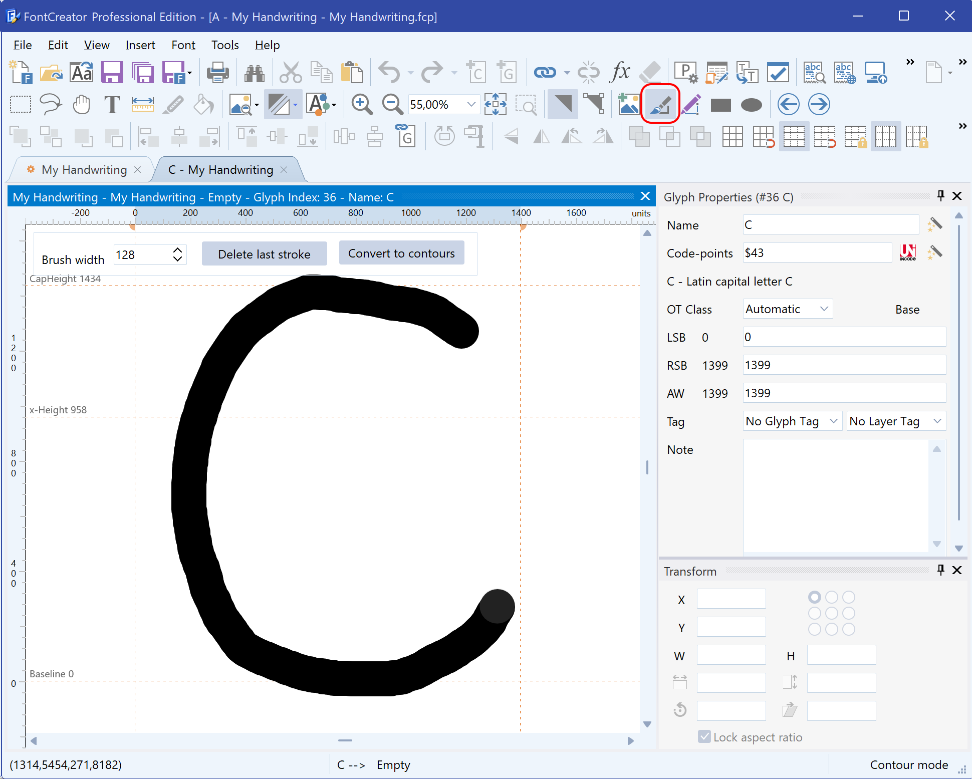
    Designing a font is a meticulous process that often culminates in the decision of how to distribute it. While some fonts are created for internal use, most designers aim to share their creations with a broader audience, whether for profit, recognition, or contribution to the design community. In this article, we will explore three primary avenues for distributing fonts: selling through marketplaces, licensing directly to clients, and contributing to open source projects. Each method has its own advantages, challenges, and best practices, which we will discuss in detail.

    1. Selling Fonts Through Marketplaces

    Font marketplaces provide designers with a platform to reach a vast and diverse audience. Websites like MyFonts, Creative Market, and FontSpring are among the most popular choices for font creators. To maximize your success on these platforms, consider the following strategies:

    Optimize Your Listings

    The key to standing out in a crowded marketplace is to make your font listings as appealing and accessible as possible. Start by using high-quality images that showcase your font in various contexts, such as logos, posters, and web design. Detailed descriptions are crucial—they should include not just the aesthetic qualities of your font, but also its technical specifications, such as the number of glyphs, language support, and format types (e.g., TTF, OTF). Accurate and relevant tags will further enhance the discoverability of your font by ensuring it appears in search results for users seeking specific styles or characteristics.

    Pricing Strategy

    Setting the right price for your font is a delicate balance between attracting buyers and ensuring fair compensation for your work. Begin by researching the prices of similar fonts within the marketplace to gauge the competitive landscape. Offering introductory discounts or bundling your fonts can be effective ways to entice initial buyers and gain traction. Remember, the pricing strategy should reflect the quality, uniqueness, and demand for your font, while also allowing room for promotional offers that can increase sales volume.

    Customer Support

    In a digital marketplace, your reputation is as important as your product. Providing prompt, courteous, and helpful customer support can differentiate you from competitors and foster customer loyalty. This not only helps in resolving issues quickly but also encourages repeat purchases and positive reviews, which are invaluable for building credibility on the platform. Consider creating a FAQ section to address common queries, and be responsive to customer feedback to continuously improve your offerings.

    Before diving into any marketplace, it's essential to thoroughly review the terms and conditions. Each platform has its own set of rules regarding pricing, distribution rights, and revenue sharing, so understanding these will help you make informed decisions and avoid potential pitfalls.

    2. Licensing Fonts Directly to Clients

    For designers who prefer a more personalized and controlled approach, licensing fonts directly to clients is an attractive option. This method allows for greater flexibility in how your fonts are used and can result in higher profits, albeit with increased responsibility.

    Set Up a System

    Managing direct font sales requires a reliable system for handling transactions, deliveries, and customer interactions. A dedicated website or online store is an effective way to manage these processes. Platforms like Gumroad or FastSpring offer user-friendly solutions for digital product sales, including secure payment processing and automated file delivery. Having your own site also allows you to showcase your portfolio and create a brand identity that resonates with potential clients.

    Tailored Licenses

    One of the major advantages of direct licensing is the ability to offer custom licenses that cater to the specific needs of your clients. For example, you can provide exclusive rights, extended usage terms, or multi-user licenses for larger organizations. Tailored licensing agreements not only add value to your font but also allow you to charge a premium for customization. Clearly outline the terms of use, including any restrictions on modifications, redistribution, or commercial usage, to protect your intellectual property.

    Build Relationships

    Direct licensing opens the door to building long-term relationships with clients, which can lead to repeat business and referrals. Beyond selling fonts, consider offering additional services such as font customization, updates, or even bespoke font design. By positioning yourself as a trusted partner in your clients’ design projects, you can foster loyalty and secure ongoing work.

    However, this approach requires diligent management of client relationships and a commitment to providing consistent quality and service. Unlike marketplace sales, where the platform handles most customer interactions, direct licensing puts the onus on you to ensure client satisfaction and uphold your professional reputation.

    3. Using Your Fonts in Open Source Projects

    Contributing your fonts to open source projects can be a fulfilling way to give back to the design community and increase your font’s visibility. However, this route comes with its own set of considerations.

    Benefits of Open Source Licensing

    Open source licensing, such as the SIL Open Font License (OFL), allows others to freely use, modify, and distribute your fonts, often resulting in wider adoption and exposure. This can be particularly beneficial if your goal is to build a portfolio, enhance your reputation, or contribute to community-driven projects. Open source fonts are frequently used in both commercial and non-commercial projects, which can lead to unexpected opportunities for collaboration or recognition.

    Risks and Considerations

    Despite the potential benefits, open source licensing means relinquishing some control over how your font is used. Others may modify your font in ways that you did not intend, or use it in projects that do not align with your values. To mitigate these risks, it’s crucial to set clear terms within the license that outline acceptable uses and any restrictions. For instance, you might specify that derivatives must credit the original creator, or that the font cannot be used in certain types of commercial products without permission.

    Deciding whether to release your font under an open source license depends on your goals and the intended audience for your work. If you prioritize widespread use and community contribution over commercial gain, open source may be the right path for you.

    Conclusion

    Distributing your fonts effectively requires careful consideration of your goals, target audience, and the level of control you wish to maintain over your work. Whether you choose to sell through marketplaces, license directly to clients, or contribute to open source projects, each approach offers unique opportunities and challenges. By optimizing your strategies for each distribution method, you can maximize the impact of your fonts and achieve your creative and professional objectives.

    Creating a Font and Editing Glyphs

    FontCreator Tutorials

    Quick Start Tutorial

    Written by Erwin Denissen. This article was originally published as part of the user manual. Updated September 16, 2024.

    Your First Font – A Brief Guide

    The quickest way to explore FontCreator is by creating a font. Let’s make a font of your own handwriting.

    Step 1: Create a New Font Project

    • In the File menu, click New Project to start a new font project.
    • In the Font family name field, type “My Handwriting” and click OK. This step is important for giving your font a personal name for easy identification.

    Step 2: Understanding the Font Overview Window

    You’ll now see the Font Overview window. Each cell represents a glyph. Some cells contain sample characters shown as light grey outlines, which serve as visual guides. These are placeholders; you’ll need to add your own glyph data. In this tutorial, we will create glyphs for the characters A, B, and C.

    Editing Glyphs

    Edit Glyph: Character "A"

    • In the Font Overview window, double-click the cell labeled A.
    • In the Glyph Edit window, choose Contour from the Insert menu or click the corresponding toolbar button (the one surrounded by a rounded red rectangle in the screenshot provided below).
      • Click with the left mouse button to add points. To create curves, hold down the mouse button and move it to form a Bézier curve.
      • Hold down the Shift key while clicking to generate straight horizontal or vertical lines.
      • Press Apply (or click the first point) to complete the contour. You may need to create multiple contours to complete the shape.
      • Ensure the contours stay within the visible area defined by the WinAscent, WinDescent lines, and the side-bearings (dashed vertical lines). This ensures the glyph will display correctly. Adjust the side-bearings if needed by dragging them.
      • Close the Glyph Edit window.

      Edit Glyph: Character "B"

      For a personalized touch, we’ll import an image of a handwritten B:

      • Prepare an image of your handwritten B with dimensions around 300x300 pixels. Bitmap, GIF, PNG, and JPG formats work well.
      • Double-click on the cell labeled B in the Font Overview window.
      • From the Tools menu, select Import Image.
      • Click Load to select your image, then click Generate. The image will appear in the Glyph Edit window.
      • Adjust the contours and ensure they fit within the visible area.
      • Close the Glyph Edit window.

      Edit Glyph: Character "C"

      • From the Font Overview window, double-click on the cell labeled C. This opens the Glyph Edit window.
      • Choose Free Draw Contours... from the Insert menu or select the Free Draw tool from the Drawing Toolbar.
      • Click and drag the left mouse button to draw your glyph, and use the right mouse button to erase parts of it.
      • Once done, press Convert to Contours to transform your drawing into editable contours.
      • Make sure the contours fit within the visible area, adjusting the side-bearings as necessary.
      • Close the Glyph Edit window to return to the Font Overview window.

      Step 3: Test Your Font

      Now that we’ve created the first three characters, let’s test the font:

      1. Go to the Font menu and select Test.
      2. In the test window, type the characters A, B, and C to view your glyphs.

        Step 4: Install and Export Your Font

        When you're satisfied with the font, you can install the font for use in other applications. Select Install from the Font menu. The Font Installation Wizard will guide you through the installation process. Once the font is installed, most applications (like Word) will recognize it immediately, though some may require a restart.

        To share your font—whether with friends, to sell online, or to use on your website—export it by selecting Export Font from the File menu. In the Font Export Settings window choose your desired format (e.g., TrueType or OpenType) and the export folder.

        Subsetting Variable Fonts with FontCreator

        FontCreator Tutorials

        Subsetting Variable Fonts with FontCreator

        written by Erwin Denissen, published September 17, 2024

        Introduction

        Variable fonts offer flexibility by enabling a single font file to encompass multiple styles—such as weight, width, and slant—within one design space. However, not all use cases demand the full range of variation that a variable font provides. By subsetting (also known as slicing a variable font) a variable font, you can reduce its complexity, tailoring it to meet specific performance and design needs.

        In this article, we’ll explore why subsetting a variable font is beneficial and show you how to accomplish it using FontCreator, a versatile font editor. We’ll also cover advanced techniques like extrapolation and setting new defaults for axis values.

        Note: We will not cover how to reduce the character set, also known as subsetting, in this article. For more information on this topic, please see:

        Improve Font Performance with Character Set Subsetting

        Why Subset a Variable Font?

        There are several reasons why subsetting a variable font can be valuable:

        1. Performance Optimization
          Reducing unnecessary variations within a font decreases the file size, leading to faster load times, especially on the web.

        2. Focused Design Requirements
          Many projects don’t require the full design space of a variable font. By subsetting, you can limit the font to just the ranges or styles needed.

        3. Simplifying User Choices
          A font with too many options can clutter the design process. Subsetting allows you to simplify the interface by offering only the most relevant styles.

        4. Handling Platform Constraints
          Some platforms may have limitations on font size or complexity. Subsetting helps adapt to these constraints without sacrificing essential features.

        Subsetting Variable Fonts with FontCreator

        FontCreator provides an intuitive interface for subsetting variable fonts. With its Subset window, you can define specific ranges or remove unnecessary axes. In addition to this, FontCreator offers advanced options like extrapolation and the ability to set new axis defaults, which further enhance your control over the font.

        Here’s a step-by-step guide on how to subset your variable font in FontCreator:

        Load Your Variable Font and Open the Subset Window

        Open your variable font in FontCreator and select Export Settings from the File menu, to adjust how the font will be exported. In the Export Settings window, click on the Subsets button to open the window where you can define subsets for different axes.

        Define Axis Subsets

        In this section, you can add a subset and provide a name, which will also be used as the style name for the newly exported font. The file name is optional; if left empty, the subset name will be used.

        Add the Axes You Want to Include

        You can adjust the variation space for each axis based on your requirements. The available axes depend on the specific variable font you are working with, such as weight, width, or slant.

        • Weight Axis: If your font supports a range from 100 to 900, but you only need a few values (e.g., 400, 600, and 700), you can limit the weight axis accordingly.
        • Width Axis: For fonts with variable widths, reduce the range to just include the needed values, such as normal and condensed.
        • Slant or Italic Axis: If slant isn’t necessary for your project, you can choose to exclude this axis entirely.
        Extrapolation

        FontCreator also offers extrapolation, allowing you to create new instances of a font by extending the range of an axis beyond the original design space. For example, if your weight axis currently stops at 900, you can extrapolate further to create a new, heavier weight. This can be useful for generating extreme styles or for cases where you need more variation than initially available.

        Setting New Axis Defaults

        Another useful feature in FontCreator is the ability to set new defaults for each axis. If you want to change the default instance of a font—say, make the medium weight (500) the default instead of the regular weight (400)—you can do this directly in the Subset window.

        However, changing the default axis values typically increases the file size, as the font has to store additional information to accommodate the new defaults. Use this feature when necessary, but be aware of its impact.

        Save Font Source

        After defining the subsets, review your settings to ensure they meet your project’s requirements. You can save the font as a FontCreator Font Project or export it as a Designspace version 5 file. The Font Project format is compact but exclusive to FontCreator. For greater compatibility, export as a Designspace file, though note that other font editors, such as FontLab and GlyphsApp, do not currently support subsetting.

        Review and Export

        Once satisfied, the subsets will be exported when you select Export Font from the File menu.


        Conclusion

        Subsetting a variable font allows you to fine-tune the design space, reducing file size and simplifying user interaction while maintaining the benefits of variable fonts. FontCreator's intuitive interface, combined with its advanced features like extrapolation and the ability to set new axis defaults, offers a high degree of flexibility for customizing variable fonts.

        Whether you’re optimizing for web performance or adjusting the design space for a specific project, FontCreator makes subsetting easy and efficient. With just a few steps, you can create a leaner, more focused font that perfectly matches your needs.

        Improve Font Performance with Character Set Subsetting

        FontCreator Tutorials

        Subsetting Fonts by Reducing the Character Set

        written by Erwin Denissen, published September 17, 2024

        Introduction

        Subsetting a font is a valuable technique for optimizing performance by reducing file size. This can be done by limiting the character set to only the glyphs you need, whether you're working with regular or variable fonts. Removing unused or unnecessary characters helps streamline your font, resulting in a smaller file that loads faster and performs better—especially for web use.

        Although FontCreator doesn't have a dedicated feature specifically for reducing the character set, it allows users to easily include or exclude glyphs during the export process. In this article, we'll show you how to manually subset a font's character set using FontCreator, whether you're working with a regular or variable font.

        Note: We will not cover how to subset a variable font by excluding axes or adjusting their ranges in this article. For more information on this topic, please see:

        Subsetting Variable Fonts with FontCreator


        Why Subset the Character Set?

        1. File Size Reduction
          Fonts often contain thousands of glyphs, including characters for multiple languages, symbols, and punctuation marks. By subsetting the font and removing unnecessary glyphs, you can significantly reduce its file size, making it faster to load and easier to handle in various applications.

        2. Optimized Web Performance
          A smaller font file means quicker load times, an essential aspect of optimizing websites and apps. Subsetting your font to only include the necessary characters ensures that it loads faster, improving the overall user experience.

        3. Tailored Character Usage
          Subsetting is especially useful if your project only requires a limited number of characters—whether it's for a specific language, brand design, or a particular set of symbols. You can customize the font to include only the characters you need, keeping the file lean and efficient.


        How to Subset the Character Set in FontCreator

        FontCreator makes it easy to manually subset a font’s character set, allowing you to select which glyphs to include or exclude during export. Here’s how you can achieve this for both regular and variable fonts:

        Step 1: Open the Font in FontCreator

        Start by opening your font in FontCreator. This loads the entire glyph set into the editor, where you can view and modify the characters as needed.

        Step 2: Deselect All Glyphs

        From the font overview window, select all glyphs by pressing Ctrl + A or using the selection tools. Right-click on the selection and choose Include in Exports -> None. This marks all glyphs as not exported.

        Step 3: Select Unmapped Glyphs

        Navigate to the left categories treeview and select Glyphs -> Unmapped. Select all glyphs, right-click, and choose Include in Exports -> All Exports. This action ensures that all OpenType layout features relying on the included characters remain functional. Additionally, make sure to set the option to exclude all unused glyphs in the Options dialog's Font page.

        Step 4: Select Desired Unicode Categories

        Navigate to the left categories treeview and select a Unicode category you want to include, such as Basic Latin. Highlight all glyphs within this category, right-click, and choose Include in Exports -> All Exports. Repeat this process for any other Unicode blocks you wish to include.

        Step 5: Select Additional Glyphs to Keep or Remove

        If needed, manually select additional glyphs you want to include or exclude from the export. This manual selection process gives you complete control over which characters will be present in the final font, regardless of whether it’s a regular or variable font.

          Step 6: Export the Subsetted Font

          Once you’ve finalized your glyph selection, go to the Export Settings window and proceed to export your font. The resulting file will include only the glyphs you chose, ensuring a smaller, more efficient font tailored to your project’s specific needs.


          Conclusion

          Subsetting a font by reducing its character set is a powerful way to optimize performance, whether you’re working with a regular or variable font. While FontCreator doesn’t have a dedicated character set reduction tool, its intuitive manual selection process makes it easy to include or exclude glyphs during export. This allows you to remove unnecessary characters and reduce file size, improving load times and making your font more manageable.

          Whether you're designing for the web, mobile apps, or specific branding projects, subsetting your font ensures that you only include the characters you need, resulting in a more streamlined and efficient font file.

          How to Make Single-Line Fonts for Engraving and Cutting

          FontCreator Tutorials

          How to Make Single-Line Fonts for Engraving and Cutting

          written by Erwin Denissen, published September 17, 2024

          Creating Single-Line Fonts for Cutting and CNC with FontCreator

          Single-line fonts are essential for cutting, engraving, and CNC applications. Programs like Make The Cut, Sure Cuts a Lot, Rhino, Silhouette Studio, and Cricut Design Space support the use of fonts for cutting designs on a variety of materials. Even though OpenType fonts are generally based on closed contours, making true single-line OpenType fonts nonexistent. However, FontCreator provides tools that allow you to design open contours, enabling the creation of fonts that can work for these tasks.

          Getting Started with Open Contours

          To create a single-line font, you’ll need to enable FontCreator's Open Contour feature. Here's how:

          Enable Single Stroke Mode:
          Go to the Font Export Settings dialog and set Open Contours to either Single Stroke or Double Stroke. Single Stroke is more efficient, but Double Stroke may work better with some engraving software. Test both to see what works best for your setup.

          Once enabled, contours will no longer be filled but displayed as strokes, which helps when designing single-line fonts.

          Step-by-Step Guide to Designing a Single-Line Font

          1. Create a New Font:
            Start by creating a new font in FontCreator. In the glyph editor, select a glyph and use the Draw Tool to design open contours. Not all contours need to be open—glyphs like 'O' may still require closed contours.

          2. Inserting and Editing Contours:
            Add new contours using the Insert Contour feature from the Insert menu. For straight lines, hold the Shift key while adding points. Curves can be created by dragging the mouse. To open an existing closed contour, right-click on the contour and select Toggle Open Contour.

            After completing your font, export it as a .ttf file. Test both the Single Stroke and Double Stroke export options to determine which works best for your project.

            Demo Font for Download

            You can download the single-line font project and font files from here:

            SingleLine.fcp

            SingleStroke.ttf

            DoubleStroke.ttf

            You can open the font project in FontCreator to see if it meets your requirements. The exported fonts can be used with your engraving software; so let us know your results!

            Important Tips

            • Text Display: Keep in mind that true single-line OpenType fonts don’t exist, as OpenType is based on closed contours. Single line fonts are specifically designed for CNC and engraving software, not for typical text display.
            • Contour Compatibility: Some features like Optimize Contours may not work well with open contours, so it’s best to manually adjust the first point when needed.
            • OpenType SVG Support: If you're designing a font for use in software that supports OpenType SVG fonts, you can colorize your glyphs and export them with SVG outlines, as SVG does support open contours. As far as we know there are no CNC tools that support fonts with SVG, so let us know if you know one!
            • Font Project Files: Save your work within font project files, as they preserve open contour settings and export configurations.

            Creating Handwritten Fonts with Contextual Alternates

            FontCreator Tutorials

            Creating Handwritten Fonts with Contextual Alternates

            written by Erwin Denissen, published September 18, 2024

            Introduction

            • Why Handwritten Fonts?
              • Handwritten fonts offer a personalized, organic feel, making them ideal for creative projects. But to avoid the mechanical look of repeating glyphs, we can introduce OpenType layout features to replace the first and last letter of a word and swap other letters with pseudo-random alternatives.
            • What We’ll Cover
              • How to replace first and last letters with contextual alternates.
              • How to create pseudo-random alternates for letters within words.
              • A deep dive into using the calt feature to make these substitutions.

              Understanding OpenType Layout Features

              • Why Contextual Substitutes Matter

                • Contextual substitutions enhance the visual variety of a handwritten font by providing alternate versions of glyphs based on their position in a word.
              • Challenges with Text Shaping Engines

                • Detecting word boundaries and how shaping engines process text can be tricky, but we’ll provide a solution that works across all software supporting OpenType layout features.

              Step 1: Preparing the Font for Substitutions

              • Create Alternate Glyphs
                • For each letter, prepare alternate glyphs for word-initial, word-final, and middle positions. Additionally, you can create multiple alternates for random substitution.
              • Naming Your Glyphs
                • Use clear naming conventions for your alternate glyphs: a.start, a.between1, a.between2, a.end for start, the two between, and end versions, respectively.

              Step 2: Implementing the OpenType Features

              • Introducing the calt Feature

                • The calt (contextual alternates) feature is key to making contextual substitutions happen. We'll set up lookup tables to identify word boundaries and substitute the appropriate glyphs.
              • Feature Code Breakdown:

                • In FontCreator, go to the OpenType Designer, and click the Code Editor button at the bottom and replace the exisitng code (or merge it) with this fea code:
                ###
                # OpenType Layout feature definitions
                # Format: OpenType Feature File Specification version 1.25.1
                # Generated by: FontCreator
                #
                
                languagesystem latn dflt; # Latin default
                
                @letter = [a-z];
                @letter.start = [a.start];
                @letter.between1 = [a.between1];
                @letter.between2 = [a.between2];
                @letter.end = [a.end];
                
                lookup SingleSubstitutionEnd { # GSUB lookup type SingleSubstitution
                    sub @letter by @letter.end;
                } SingleSubstitutionEnd;
                
                lookup SingleSubstitutionBetween { # GSUB lookup type SingleSubstitution
                    sub @letter by @letter.between1;
                } SingleSubstitutionBetween;
                
                lookup SingleSubstitutionStart { # GSUB lookup type SingleSubstitution
                    sub @letter by @letter.start;
                } SingleSubstitutionStart;
                
                lookup SingleSubstitution1 { # GSUB lookup type SingleSubstitution
                    sub @letter.between1 by @letter.between2;
                } SingleSubstitution1;
                
                feature calt { # Contextual Alternates
                    lookup ChainingContextStart { # GSUB lookup type ChainingContext
                        ignore sub @letter.start @letter';
                        ignore sub @letter.between1 @letter';
                        ignore sub @letter @letter';
                        sub @letter' lookup SingleSubstitutionStart @letter;
                    } ChainingContextStart;
                
                    lookup ChainingContextBetween { # GSUB lookup type ChainingContext
                        sub @letter.start @letter' lookup SingleSubstitutionBetween @letter;
                        sub @letter.between1 @letter' lookup SingleSubstitutionBetween @letter;
                    } ChainingContextBetween;
                
                    lookup ChainingContextEnd { # GSUB lookup type ChainingContext
                        ignore sub @letter' @letter;
                        sub @letter.start @letter' lookup SingleSubstitutionEnd;
                        sub @letter.between1 @letter' lookup SingleSubstitutionEnd;
                    } ChainingContextEnd;
                
                    lookup ChainingContextRotate { # GSUB lookup type ChainingContext
                        sub @letter.between1 @letter.between1' lookup SingleSubstitution1;
                    } ChainingContextRotate;
                } calt;

                Step 3: Testing and Refining Your Font

                • Testing in FontCreator
                  • Use FontCreator’s preview features to test the contextual substitutions in various contexts.
                • Ensure Compatibility
                  • Make sure your font works across a variety of software that supports OpenType features, like Adobe software, Microsoft Word, and web browsers.

                Conclusion

                • Summing Up
                  • Designing handwritten fonts with OpenType layout features adds complexity, but the results can make a font feel much more dynamic and unique.
                • Next Steps
                  • Once you've mastered contextual alternates, consider adding more advanced OpenType features like ligatures or stylistic sets.

                OpenType Fractions Using Reverse Chaining Substitution

                FontCreator Tutorials

                OpenType Fractions Using Reverse Chaining Substitution

                written by Erwin Denissen, published November 21, 2024

                Implementing Fractions in OpenType Fonts

                Fractions are essential in typography for displaying mathematical expressions, measurements, and more. The frac feature in OpenType fonts replaces figures (digits) separated by a slash (U+002F) or a fraction slash (U+2044) with “common” (diagonal) fractions.

                Common Method for Implementing Fractions

                One of the more common ways to implement the frac feature is as follows:

                @figures = [zero one two three four five six seven eight nine];
                @figuresNumerator = [zero.numr one.numr two.numr three.numr four.numr five.numr six.numr seven.numr eight.numr nine.numr];
                @figuresDenominator = [zero.dnom one.dnom two.dnom three.dnom four.dnom five.dnom six.dnom seven.dnom eight.dnom nine.dnom];
                @slash = [slash fraction];

                feature frac {
                sub @figures by @figuresNumerator;
                sub [@slash @figuresDenominator] @figuresNumerator' by @figuresDenominator;
                sub slash by fraction;
                } frac;

                Issues with the Common Method:

                While this method effectively formats fractions, it can inadvertently affect non-fractional digits and slashes within text blocks. For example:

                1/2 123/456 4 5/8 m/s

                  Potential Problems:

                  • The slash in "m/s" would be substituted with the fraction slash.
                  • Digits not intended to be part of a fraction (like the "4") would be converted to numerator forms.
                  • This leads to incorrect rendering and affects readability.

                  New Approach Using Reverse Chaining Single Substitution (rsub)

                  To address these issues, we can use a more precise method that only affects actual fractions, leaving other parts of the text untouched. One effective approach is using GSUB LookupType 8 (Reverse Chaining Contextual Single Substitution), a technique we developed in June 2021.

                  Here is the proposed solution:

                  @figures = [zero one two three four five six seven eight nine];
                  @figuresNumerator = [zero.numr one.numr two.numr three.numr four.numr five.numr six.numr seven.numr eight.numr nine.numr];
                  @figuresNumeratorEx = [fraction @figuresNumerator];
                  @figuresDenominator = [zero.dnom one.dnom two.dnom three.dnom four.dnom five.dnom six.dnom seven.dnom eight.dnom nine.dnom];
                  @figuresDenominatorEx = [fraction @figuresDenominator];

                  feature frac {
                  sub @figures slash' @figures by fraction;
                  rsub @figures' @figuresNumeratorEx by @figuresNumerator;
                  sub @figuresDenominatorEx @figures' by @figuresDenominator;
                  sub @figures space' @figuresNumerator by space.frac;
                  } frac;

                  Advantages of the New Method:

                  • Contextual Precision:
                    • Only affects digits and slashes that are part of actual fractions.
                    • Leaves other digits and slashes in the text untouched.
                  • Preservation of Non-Fraction Content:
                    • Units like "m/s" remain correctly formatted.
                    • Mathematical expressions or measurements not intended as fractions are displayed as intended.

                  Summary of Benefits

                  • Avoids Unintended Substitutions:
                    • The common method alters all digits and slashes, which can be problematic in running text.
                    • The new method selectively applies substitutions, enhancing typographic accuracy.
                  • Enhances Readability:
                    • Readers can correctly interpret measurements and units without confusion.
                    • Fractions are formatted appropriately without affecting surrounding text.
                  • Improves User Experience:
                    • Typists and designers can input text without worrying about incorrect glyph substitutions.
                    • The font behaves predictably, which is essential for professional typography.

                  Final Thoughts

                  Implementing the frac feature using rsub provides a significant advantage in handling real-world text scenarios. By focusing substitutions only where they are needed, we maintain the integrity of the text and enhance the overall typographic quality of the font.

                  Get FontCreator Coupon – Exclusive Font Editor Discount

                  FontCreator Discount Coupon

                  Introduction

                  Welcome to our official discount page for FontCreator! We understand that savvy shoppers often look for coupon codes to save on their purchases. That’s why we created this page—to ensure you always get authentic and valid discounts directly from us.


                  Why Choose FontCreator?

                  • Powerful Features: Designed to streamline your workflow, our font editor offers an intuitive interface and robust set of features.
                  • Reliable Support: We take pride in providing fast and friendly customer support, ready to assist you every step of the way.
                  • Trusted by Thousands: Join our community of satisfied users who rely on FontCreator to boost productivity and efficiency.

                  Your 15% Off Coupon Code

                  We’re pleased to offer you a 15% discount on all our software. The discount can be applied by entering the promotional code “CPN4WLV15” at the checkout page.

                  Buy Now & Save 15%


                  Satisfaction Guaranteed

                  We’re confident you’ll love FontCreator. If you have any questions or concerns, our dedicated support team is here to help—simply contact us or email us at Cette adresse e-mail est protégée contre les robots spammeurs. Vous devez activer le JavaScript pour la visualiser..


                  • Coupon valid on new purchases only.
                  • Discount cannot be combined with other promotions.
                  • Terms and conditions apply.

                  Creating a Bold Version of Your Handwriting Font

                  Scanahand Tutorials

                  Creating a Bold Version of Your Handwriting Font

                  written by Erwin Denissen, published April 30, 2025

                  Generate Your Original Font

                  In this quick tutorial, you'll learn how to use the Weight Conversion setting to effortlessly create a heavier, bold version of your own handwriting font.

                  • Open Scanahand and print the empty template of the Basic Character Set.
                  • Go to Completed Template view (F6) and fill out your personal handwriting template and scan or import it into Scanahand.
                  Scanahand completed template page
                  • Go to Font view (F7) and click the Generate... button.
                  • In the Font Setup dialog, enter your font name (e.g., “My Font”), ensure the checkbox “Show advanced settings” is ticked, and select Regular from the Style dropdown box, and select Normal from the Weight dropdown box, and click OK to generate the font.
                  Scanahand Font Generation Setup dialog for normal font
                  • After the font generation is completed, you will see a preview of your Regular font. Save and install the font, so you can use it in other software.
                  Scanahand preview text of the generated normal-weight font

                  Regenerate Your Font with a Heavier Weight

                  • With your font still open, we once more click the Generate... button.
                  • In the Font Setup dialog, select Bold from the Style dropdown box, and select Bold from the Weight dropdown box. Ensure the font family name remains the same (“My Font”) so that your bold version integrates seamlessly.
                  Scanahand Font Generation Setup dialog for bold font
                  • Click OK to regenerate your font.
                  • After the font generation is completed, you will end up with the Bold variant of your font. Save and install the font, and use it in your favorite applications. Enjoy the richer, bolder appearance of your personalized font!
                  Scanahand preview text of the generated bold font
                    • Enjoy Your New Bold Handwriting Font

                      That's it! With Scanahand, creating bold, expressive fonts based on your handwriting is quick and easy.

                    Export Project Fonts for Clients and Printers

                    MainType Tutorials

                    Export Project Fonts for Clients and Printers

                    written by Erwin Denissen, published January 19, 2026

                    When you share design files with clients, print vendors, or collaborators, everyone needs access to the exact fonts you used, without digging through your entire font library. MainType is the perfect font manager, as it streamlines this process: organize your project fonts into a Group, then export them as a structured, ready-to-share folder.

                    Before you start: Most commercial fonts restrict redistribution. Verify your font licenses permit sharing before exporting files to third parties.

                    Edition note: Font export features require MainType Standard Edition or higher. They're not available in the Free Edition.

                    Method 1: Export fonts from a project group (recommended)

                    This method gives you maximum flexibility and keeps your original font library untouched while creating clean export packages.

                    A group is a virtual collection: it organizes fonts without moving or changing any files on your system. Most designers find this perfect for project work and create separate groups for each client, campaign, or deliverable.

                    Step 1: Create a project-specific group

                    Open the Groups panel and create a new group named after your project (for example, Client – Brochure – 2026). If you want to keep things organized, add subgroups for styles, deliverables, or team members.

                    Acme Corp – 2026 Annual Report
                    Social Media Templates – Q1
                    Print Campaign – Spring Collection

                    Step 2: Collect the fonts you need

                    Browse any font view in MainType, then drag the fonts your project uses directly into your new group. You can select multiple fonts at once and drag them together. Hold CTRL while dragging if you prefer to move fonts instead of copying references.

                    Step 3: Export the group with folder structure preserved

                    Right-click your project group and select Export Fonts. Choose a destination folder. MainType will export all fonts while maintaining their original folder hierarchy.

                      This is the key advantage: even if your fonts came from a dozen different folders, the export preserves that organization, making it easy for recipients to understand and install the fonts months later.

                      Result: A clean, self-contained folder you can zip and send, with a logical structure that survives long-term archiving.

                      Method 2: Keep a "project fonts" folder synced on disk

                      If you work on recurring projects or need an always-ready archive folder (for example, if print vendors request updated files periodically), use MainType's Keep in Sync feature.

                      Step 1: Create a project folder on your hard drive

                      Set up a dedicated folder for your project fonts:

                      D:\Projects\Acme Corp\2026 Annual Report\Fonts

                      Step 2: Add it as a Keep in Sync group in MainType

                      Keep in Sync groups are different from regular groups: they mirror an actual folder on your drive. You can’t rename or move them from within MainType. Make those changes in Windows File Explorer instead. When you add fonts to a Keep in Sync group, MainType copies the font files into that linked folder on disk.

                      Step 3: Drag fonts into the Keep in Sync group

                      As you identify fonts for your project, drag them into this group. MainType automatically places the files in your project folder on disk.

                      Your Fonts folder now stays current without manual exports. You can zip it anytime or still use Export Fonts if you want MainType to generate a fresh package with updated organization.

                      Exporting fonts from Adobe Creative Cloud and other installers

                      Windows font management has a hidden complexity: the Fonts control panel doesn't always reveal where font files actually live. Installed fonts may appear in the Windows Fonts folder, but the underlying files can be stored elsewhere, especially for fonts managed by third-party applications.

                      The Adobe Fonts challenge

                      Adobe Creative Cloud syncs fonts in a way many font utilities can't locate them:

                      • Adobe Fonts live in a protected CoreSync cache
                      • They're removed from disk if unused for extended periods
                      • Non-Adobe applications may lose access if fonts aren't recently synced
                      • Most font tools can't extract files from Adobe's proprietary storage

                      MainType handles this because it indexes fonts at the system level and maintains its own Vault copy of font data.

                      How to export system-installed or cloud-managed fonts

                      1. Select the fonts in any MainType view (including fonts from Adobe, Google Fonts installers, or other managers)
                      2. Right-click and choose Export...
                      3. Pick a destination folder and MainType will write the font files to disk

                      Even if the original font file location is obscure or temporarily unavailable, MainType can reconstruct usable font files from its indexed data.

                      Once exported, add those files to your project group and use Export Fonts to build your final client package.

                      Important licensing reminder

                      Font licenses vary widely. Some allow you to share font files with clients, printers, or teammates as part of a project; others explicitly restrict redistribution or limit use to licensed users/devices (this can include fonts synced or installed by third-party services).

                      MainType can export font files, but you are responsible for making sure any sharing or redistribution complies with the font’s license agreement.

                      Related tutorials

                      Shared Font Libraries — Keep team fonts synchronized across workstations

                        FontCreator 11.5 released

                        News

                        FontCreator 11.5 released - February 22, 2018

                        We're really excited to announce FontCreator 11.5 as it includes several important bug fixes, enhancements, and improvements that will help you build awesome fonts. The most impressive improvements are: Support for Unicode variation sequences Comes with ttfautohint version 1.8.1 Open contours while designing fonts Export as single line font * Support for last resort fonts *) Open contours are not allowed in fonts, so FontCreator will do some magic to make fonts look like single line fonts which can be used for engraving.

                        FontCreator Product Details

                        Download FontCreator

                        FontCreator 12 released

                        News

                        FontCreator 12 released - May 7, 2019

                        We're proud to announce FontCreator 12 as it includes several major improvements and new features that will help you build awesome fonts.

                        The most impressive improvements are:

                        • Improved generation of friendly glyph names
                        • New glyph sort (design mode)
                        • Unicode 12 support
                        • Improved complete composites
                        • Auto Attach repositions glyph members based on anchors
                        • Extended generation of OpenType layout features (frac, liga, mark, mkmk, init, medi, fina, curs, salt, ssxx, cvxx, etc.)
                        • Custom and generic localized forms
                        • Preview support for comparing same text with different features enabled
                        • Smart glyph switching in Glyph Edit windows

                        FontCreator has been using friendly glyph names for a long time, but it never fully used the power of it. With this release we've further improved friendly glyph names, which also allow smart feature generation based on glyph names and their suffixes. A new glyph sort (design mode) sorts glyphs in categories, which allow you to better concentrate on specific groups of glyphs.

                        OpenType Feature Generation

                        Besides automatically creating kerning pairs for pair adjustment lookups, FontCreator can automatically add numerous other OpenType layout features to your font. Within the OpenType Designer window click the first icon from the upper left corner. You will now be able to select which features you want to generate and/or update. The generator heavily relies on glyph names, so ensure your font contains glyphs with friendly glyph names as explained in the user manual.

                        The Benefits of Anchors

                        Using anchors to position mark glyphs with respect to mark and base glyphs has several benefits, especially in combination with auto attach, as then changes to your base and mark glyphs instantly update your composites, taking into account both outlines and anchor positions. The new feature generator adds all required lookups and features for anchor based positioning; supporting special marks for upper case glyphs, narrow glyphs, and more. The tutorial Latin Diacritical Marks - Accents explains how to add support for Latin diacritical marks in your fonts.

                        Insert Glyphs Dialog

                        The enhanced Insert Glyphs dialog supports formulas for generating the glyph outlines as a composite. It is based on anchors, so ensure your glyph members have appropriate anchors. The metrics of the composite glyph will also be calculated, and available kerning between individual glyphs will also be applied. Just provide the glyph name, followed by an equal sign and the glyph names separated by a plus sign. Don't use spaces as that would be treated as a new glyph you want to insert. Here is an example:
                        f_i_j=f+i+j
                        It will add a glyph named f_i_j and will make it a composite that is made out of these glyphs: f, i, and j.

                        You can also use such a formula on an existing glyph. Select Custom Formula from the Edit menu.

                        Preview support for comparing same text with different features enabled

                        The preview text allows you to enable and disable features for subsequent text. This allows you to test several feature combinations at once, so for example you can compare how small capitals behave with and without kerning applied. It also allows you to compare the way lining and oldstyle figures work with tnum or pnum enabled.
                        Within the preview text provide “/otsettings=” to override or “/otsettings+” to enable and disable features. For example:
                        /otsettings= 0123456789 /otsettings=pnum 0123456789 /newline /otsettings=onum 0123456789 /otsettings=onum+pnum 0123456789

                        Smart Glyph Switching

                        Within a glyph edit window, you can enable the Comparison toolwindow. You can then, while holding down the Alt key, click any glyph to switch to it. This allows you to quickly switch between glyphs within a single glyph edit window.

                        Other Improvements

                        This new release comes with many more improvements, like a new window tab bar, extended reopen menu, snap to guidelines for anchor movement, enhancements to transform scripts, support for glyph ranges in glyph transformer, and much more, as explained in the user manual, as available from the support page.

                        You can download FontCreator 12 from our download page. Please use our forum to discuss the new features; enjoy!


                        MainType 9 released

                        News

                        MainType 9 released - July 18, 2019

                        We're proud to announce MainType 9 as it includes several major improvements and new features that will help you manage your fonts.

                        The most impressive changes are:

                        • Smart font install
                        • Select duplicates feature
                        • Speed improvements due to new font preview cache
                        • Improved display of similar fonts
                        • Unicode 12.1 support
                        • Fully compatible with Windows 10 May 2019 Update (version 1903)
                        • No more plugins

                        No More Plugins

                        We usually focus on adding new features, but this time we've decided to stop providing plug-ins. Only customers who (do most of their) work in Adobe InDesign benefit from the plugins, so most users never used them. You can read more about this decision here.

                        Using groups within MainType is by far the best independent way to manage fonts per project, no matter if you design documents in Adobe InDesign, Photoshop, Illustrator, Serif Affinity Designer, or even Microsoft Word. When you decide to use a specific font in a document, just add it to the group. The next time you start working on the project, you can select the group, and click the Install group button to ensure that all fonts are available.

                        Duplicate Fonts

                        Over they years your font collection might contain more and more duplicate fonts. MainType now comes with a new feature that selects all duplicates. This allows you to clean up your font library from outdated versions of your fonts.

                        Smart Font Install

                        Windows won't allow you to install more than one version of each font. So upon installing a font MainType verifies if another version is already active. With MainType 9, it will automatically uninstall that version. So no more checking and guessing, MainType takes care of this, pretty smart ;-)

                        You can download MainType 9 from our download page. Please use our forum to discuss the new features; enjoy!


                        MainType 10 released

                        News

                        MainType 10 released - July 14, 2020

                        We have just released MainType 10, coming with several amazing new features and improvements.

                        The most impressive changes are:

                        • New OpenType layout features in Sample panel
                        • New Note panel to add a custom note to your fonts
                        • New dark theme
                        • Show sample text
                        • Improved high DPI support
                        • Improved PANOSE output
                        • Added Safe Mode, so you can delete fonts that are causing trouble
                        • Update vendor information
                        • Expanded custom views with a total of 3 features
                        • More metrics in Font Information panel

                        Custom Notes

                        You can now add a note to your fonts. You can use it to store ideas, font usage, order details, etc. Initially the Note panel is not shown, so go to the main menu and select View -> Panels -> Note.

                        Dark Theme

                        You can now switch to Dark Theme, which some people prefer as it reduces power usage and improves visibility in a low-light environment.

                        You can download MainType 10 from our download page. Please use our forum to discuss the new features; enjoy!


                        MainType 11 released

                        News

                        MainType 11 released - May 19, 2021

                        We have just released MainType 11, coming with several amazing new features and improvements.

                        The most impressive changes are:

                        • Improved support for variable fonts with axis sliders
                        • Improved OpenType layout features in Sample panel
                        • Improved network support
                        • Improved themes
                        • Improved high DPI support
                        • Updated vendor information

                        Variable Fonts

                        As most designers know, a variable font is a single file, containing one or more axis (like weight or width) which allow you to use a continuous range of style variations by means of interpolation. In short, it allows you to make the most of a font family’s range of styles. These fonts are fully supported by all major web browsers, and although slowly, more and more desktop software adopt this technology. In order to help you find the right font for your needs, MainType now shows all available axis sliders in the sample panel. It also allows you to select a named instance. How cool is that!

                        OpenType Layout Features

                        Use the available features as shown on the left of the sample panel, to activate specific features, like kerning.

                        You can download MainType 11 from our download page. Please use our forum to discuss the new features; enjoy!


                        MainType 12 released

                        News

                        MainType 12 released - August 17, 2023

                        We have just released MainType 12, coming with several amazing new features and improvements.

                        The most impressive changes are:

                        • Improved sliders for variable fonts in Sample panel
                        • Improved support for OpenType layout features
                        • Improved theme support
                        • Improved usability
                        • Improved high DPI support

                        Variable Fonts

                        As most designers know, a variable font is a single file, containing one or more axis (like weight or width) which allow you to use a continuous range of style variations by means of interpolation. In short, it allows you to make the most of a font family’s range of styles. These fonts are fully supported by all major web browsers, and although slowly, more and more desktop software adopt this technology. In order to help you find the right font for your needs, MainType now shows all available axis sliders in the sample panel. It also allows you to select a named instance. How cool is that!

                        OpenType Layout Features

                        Use the available features as shown on the left of the sample panel, to activate specific features, like kerning.

                        You can download MainType 12 from our download page. Please use our forum to discuss the new features; enjoy!


                        MainType 13 released

                        News

                        MainType 13 released - May 21, 2025

                        We’re thrilled to announce MainType 13, a major update that introduces a brand-new way to browse your library and a host of workflow-boosting refinements.

                        The most impressive changes are:

                        • New Grid View: Easily switch between the new grid view and the existing details view
                        • Export Groups with Folder Structure: Right-click any Group to export fonts while preserving the original folder hierarchy
                        • Updated Unicode Support: Now fully updated to Unicode version 17
                        • Refreshed Foundry List: new installations only
                        • Improved support for OpenType layout features
                        • Improved theme support
                        • Improved usability

                        Grid View

                        Instantly switch from the classic Details View to the new Grid View and back again. Browse your collection as large, uniform thumbnails—or dive into the familiar tree-style list—whenever it suits your workflow.

                        Export Groups with Folder Structure

                        Right-click any group and export its fonts while keeping the original folder hierarchy intact—perfect for handing off projects or archiving.

                        Behind the scenes, MainType 13 polishes the entire experience: fresh installs pull in an updated foundry list; the shaping engine has been improved, so kerning, alternates, and complex scripts behave exactly as designers expect. Interface translations cover more languages, and a host of subtle usability tweaks make everyday font management feel smoother than ever.

                        Download MainType 13 and start exploring the new Grid View today. Have thoughts or questions? Join the conversation on our forum—see you there!


                        Calligraphy For Dummies Highlights Scanahand and FontCreator

                        News

                        Scanahand & FontCreator featured in the new Calligraphy For Dummies - January 2, 2026

                        We’re happy to share that the new edition of Calligraphy For Dummies by Jim Bennett includes a full chapter about our tools Scanahand and FontCreator.

                        Jim is a professional calligrapher and artist who has used our software for years to turn his hand-lettered work into fonts. In the book he shows, step by step, how calligraphers can do the same.

                        A friendly introduction for beginners

                        Calligraphy For Dummies is written for people who love calligraphy, not for technical experts.

                        In Chapter 19, Jim explains in simple language how you can:

                        • Write your letters by hand
                        • Scan or photograph your calligraphy
                        • Bring those images into Scanahand and FontCreator 
                        • Clean up the shapes and spacing
                        • Turn your own handwriting or calligraphy into a usable font

                        You don’t need to know anything about typography or software to start. The chapter is designed to guide you through the process in a clear and relaxed way.

                        Why this is helpful for calligraphers

                        If you are new to calligraphy or still building your skills, creating a font from your own writing can help you:

                        • Try out layouts and designs quickly on screen
                        • Print beautiful pieces of “your” calligraphy without rewriting everything by hand
                        • Experiment with different sizes and compositions before doing a final piece
                        • Offer clients a custom font based on your personal style

                        Scanahand gives you a very simple way to turn your handwriting into a font, and FontCreator lets you refine the details when you are ready.

                        See the tools in action and learn more

                        Jim also created a short demo video that shows how he uses Scanahand in his calligraphy workflow:

                        👉 Scanahand video demo

                        You can find the new edition of Calligraphy For Dummies here:

                        👉 Book link

                        If you have ever thought “I wish I could make a font from my own calligraphy,” this chapter is a great, beginner-friendly way to get started with Scanahand and FontCreator.

                        Modern Windows apps, universal fonts

                        News

                        Modern Windows apps, universal fonts - January 6, 2026

                        Starting in 2026, the Windows editions of our applications will be released only as 64-bit applications.

                        This change affects how our software runs on Windows, not what your fonts can do. Fonts created with our tools remain standard OpenType/TrueType fonts that work across 32-bit and 64-bit systems and a wide range of platforms.

                        What exactly is changing?

                        • New Windows releases of our software (FontCreator, MainType and Scanahand) from 2026 onward will be 64-bit only.
                        • Existing 32-bit versions will continue to work on compatible 32-bit Windows systems you already use.
                        • On macOS, nothing changes: FontCreator already targets current, 64-bit-only versions of macOS.

                        If you are running Windows 11 or a 64-bit edition of Windows 10, 8, or 7, you are already on a 64-bit platform and can continue to install and use our software as usual.

                        Fonts remain universal

                        The most important point is simple:

                        The fonts you create with our software remain standard OpenType/TrueType fonts and work on both 32-bit and 64-bit systems.

                        Switching our Windows apps to 64-bit:

                        • Does not change the format of the fonts you produce.
                        • Does not limit where those fonts can be used, as long as the environment supports standard OpenType/TrueType fonts (which includes 32-bit and 64-bit apps on Windows, macOS, Linux and many other platforms).

                        We are changing the “bitness” of the tools (FontCreator, MainType, Scanahand), not of the fonts themselves.

                        Why now?

                        The broader ecosystem has moved decisively toward 64-bit:

                        • Windows 11 is 64-bit only. There is no 32-bit edition of Windows 11; any PC running Windows 11 is a 64-bit system.
                        • Windows 10 reached end of support on October 14, 2025 for home and business users, meaning it no longer receives regular security or feature updates.
                        • Valve’s Steam platform is ending support for 32-bit Windows 10 as of January 1, 2026, and notes that only about 0.01% of its users remain on Windows 10 32-bit.

                        For our applications, focusing on 64-bit brings clear advantages:

                        • More comfortable handling of large font projects, variable fonts and color fonts.
                        • More available memory for operations like autokern, optical metrics, and complex glyph imports.
                        • A simpler build and test matrix, so we can devote more time to new features and quality improvements instead of maintaining parallel 32-bit builds.

                        In short: almost everyone is already on 64-bit, and modern font workflows benefit from it.

                        What this means for you

                        To summarise:

                        • If you are on 64-bit Windows or macOS, you can continue to install and use our software as normal; future releases will simply be 64-bit applications.
                        • If you are on 32-bit Windows, you can keep using the last 32-bit versions you already have installed, but new features and releases from 2026 onward will require a 64-bit system.
                        • The fonts you create remain universal: standard OpenType/TrueType fonts that work on both 32-bit and 64-bit systems and across many platforms.
                        • For modern fonts and newer technologies (especially variable fonts), we recommend using a current major version of our tools rather than software that is a decade old.

                        We’re grateful that so many people have been with us since the late 1990s. Moving our Windows applications fully to 64-bit, while keeping your fonts as broadly compatible as ever, is one more step in keeping our tools ready for today’s and tomorrow’s font workflows.

                        FontCreator 10.1 released

                        News

                        FontCreator 10.1 released - November 30, 2016

                        We're pleased to announce FontCreator 10.1 as it includes several improvements that will help you build awesome fonts. With FontCreator 10.1, font designers can create and modify high quality TrueType and OpenType fonts faster than ever. The most impressive improvements are: Improved glyph outline editor Autokern unmapped glyphs Smart glyph navigation based on active category Support for feature params in OpenType code compiler for character variants, optical size, and stylistic sets Improved detection of overlapping kerning classes

                        FontCreator Product Details

                        Download FontCreator

                        FontCreator 11 released

                        News

                        FontCreator 11 released - May 10, 2017

                        Today High-Logic B.V. released FontCreator 11, coming with the most advanced OpenType layout features editor, an improved glyph editor supporting both quadratic- and cubic-based contours, and tons of enhancements to increase productivity. FontCreator 11 benefits from improvements to the glyph editor supporting both quadratic- and cubic-based contours. It has several smart features to ensure smooth curve connections where you need them. Split self-intersecting contours is a new and easy way of removing unwanted parts of a contour. You can now quickly edit all glyph names, using free text and find and replace. Complete composites, optical metrics, and automatic kerning have been further improved, and the OpenType Designer has become even more intuitive. With this new release our font editor comes with a new icon set, improved support for high-resolution monitors, and it is available in both 32-bit and 64-bit versions. The 64-bit version is significantly faster (20 to 30 percent), which is most noticeable with time-consuming tasks like autokern, exporting fonts, and image to outline conversions. It is also able to make use of more memory which is especially useful if you edit large fonts.

                        FontCreator Product Details

                        Download FontCreator

                        Scanahand 6 released

                        News

                        Scanahand 6 released - September 28, 2017

                        We've just released Scanahand 6. It includes several powerful and awesome improvements, which make your fonts look better than ever! Scanahand makes it easy to create fonts from your handwriting. This brand new version has improved left and right side bearing calculation, a brand new icon set, improved support for high-resolution monitors, and it is available in both 32-bit and 64-bit versions.

                        Scanahand Product Details

                        Download Scanahand

                        News

                        News

                        MainType 8 released

                        News

                        MainType 8 released - January 17, 2018

                        We've just released MainType 8, coming with several enhancements and improvements that will help you manage your fonts. MainType is the font manager for graphic artists, typographers, and other power users who demand easy access to their font collection. MainType always works; even for users with restricted rights. This brand new version supports variable fonts, includes new font properties and allows you to import and export font ratings and font tags. It comes with plugins for Adobe InDesign, a brand new icon set, improved support for high-resolution monitors, and is available in both 32-bit and 64-bit versions.

                        MainType Product Details

                        Download MainType

                        Font Manager

                        Organize and Control Your Fonts with Ease

                        “The best software I’ve ever used for managing typefaces!”

                        MainType takes the frustration out of handling your font library. This powerful yet user-friendly application makes it simple to find, preview, organize, install, and print fonts—so you can focus on creativity instead of clutter.

                        • Free Edition: Manage up to 2,500 fonts
                        • Instant Activation: Enable fonts for all your favorite design programs
                        • Comprehensive Tools: Preview, browse, and install with just a few clicks
                        • Advanced Sorting & Search: Quickly locate the perfect typeface

                        MainType Product Details

                        Try MainType risk-free!

                        MainType runs on Windows 11, 10, 8, and 7. It never expires in free edition mode, giving you unlimited access to essential tools for managing and organizing your fonts.

                        FMSProxy

                        MainType Tutorials

                        FmsProxy

                        written by Erwin Denissen, published April 25, 2019, updated July 2, 2021

                        What is FmsProxy?

                        FmsProxy is a small program that comes with MainType and runs in the background. It is connected to the High-Logic Font Management Service (fontservice) and acts as a doorway between the fontservice (running as administrator) and your user environment where your fonts are installed. The main tasks of FmsProxy are:

                        • Notify the fontservice of changes in the loaded fonts
                        • Retrieve fonts from the network that the fontservice can't access

                        What happens if FmsProxy is not running?

                        MainType won't be able to access fonts located on the network. So no worries if you don't have such fonts.

                        How can I see if FmsProxy is running?

                        The easiest way to see the status of FmsProxy is to start the font management service configuration utility (FmsConfig). You can find it in Windows start menu, but for your convenience you can also access it through MainType's main menu (Tools -> Create and Restore Backups). The status of FmsProxy will be indicated by a small icon.

                        Why do I keep getting notifications in MainType that FmsProxy is not running?

                        When you install MainType, FmsProxy is also automatically installed and set to run each time you start your computer. Some programs and system optimizer software may remove FmsProxy.

                        How can I reenable FmsProxy?

                        First look in Windows Settings, Apps, Startup and make sure that Font Management Proxy is turned on.

                        If it is turned on, try to reinstall MainType over your existing installation as that usually solves the problem. If you currently have an older version of MainType, we strongly recommend upgrading to the latest version.

                        Font-Creator

                        Font Creator

                        With over 5 million downloads to date, FontCreator is the world's most popular font editor.

                        Font Creator

                        High-Logic FontCreator for macOS and Windows

                        FontCreator is a professional font editor and has all the tools you need to make and edit your own fonts, modify existing fonts, redesign characters, update font properties, add kerning, edit advanced OpenType layout features, and much more. Click the Download FontCreator button below to get the free trial.

                        Easy to use and powerful font editor
                        FontCreator supports all modern font formats
                        Advanced drawing tools
                        Fonts can be used on Windows, Mac OS X, Linux, and in all modern web browsers
                        Proven font technology since 1997

                        Font Editor

                        FontCreator

                        Join the club. You can't go wrong with the fully functional 30-day trial.

                        Font Editor

                        Create and Refine Your TrueType and OpenType Fonts

                        With over 5 million downloads, FontCreator has become the world’s most trusted solution for designing and customizing fonts. Whether you’re crafting entirely new typefaces or enhancing existing ones, this comprehensive application for Windows and macOS has all the tools you need to:

                        • Develop and refine glyph outlines
                        • Update internal font information
                        • Adjust kerning pairs
                        • Add or modify advanced OpenType layout features
                        • And much more!

                        Highlights of FontCreator

                        • User-Friendly Interface with Advanced Options: Quickly learn the basics, then dive into powerful features when you need them.
                        • Support for Modern Formats: Export fonts compatible with Windows, macOS, Linux, and all major web browsers.
                        • Sophisticated Editing Tools: Precisely shape characters, modify contours, and manage spacing for a truly polished font.
                        • Cross-Platform Compatibility: Use your custom fonts across multiple operating systems for a seamless experience.

                        Join designers, typographers, and creative professionals worldwide who rely on FontCreator to bring their lettering ideas to life.

                        requestdelay

                        Request Received

                        Your request has been received. Unfortunately we need to manually process it, so please allow up to two business days for processing. If we require additional information we will contact you on the e-mail address we have on record.

                        requestfailed

                        Request Failed

                        We couldn't find any registration data based on the provided information, please check your spelling and try again. Please note that registration codes older than 5 years are no longer stored on our system and can therefor not be retrieved. If you no longer have access to the e-mail address you used during registration, please contact customer support.

                        Newsletters

                        Newsletters

                        If you would like to keep informed about our software updates and new releases, please fill out your name and email address to receive our newsletters.

                        Name Email Subscribe Unsubscribe Submit

                        Font License Agreement

                        Font License Agreement

                        If you've reached this page, it is most likely due to link within a font made with a trial or home edition of FontCreator. You may not use that font for commercial purposes. If you know about people selling such fonts, do let us know here! FontCreator standard and professional do allow you to make commercial fonts, so please go to the FontCreator product page for more information. If you want to use a font that was made with FontCreator home edition, you need to contact the font designer and ask him to regenerate the font with FontCreator standard or professional edition.

                        FontCreator Product Details

                        Test Page

                        Download Thank You

                        Thank You

                        You've just been sent an email to confirm your email address. Please click on the link in this email to confirm your subscription. You will then get access to the free download. In case you haven't received the confirmation email, please check your spam folder.

                        Custom Templates

                        Scanahand – Custom Templates

                        We have collected several custom made templates which can be used with Scanahand premium edition.

                        This template covers Windows Codepage 1250 and thus contains characters for Polish, Czech, Slovak, Hungarian, Slovene, Serbian, Croatian, Romanian, and Albanian. It contains basic Latin as well as the following characters: Á Ă Â Ä Ą Ć Č Ç Ď Đ É Ě Ë Ę Í Î Ĺ Ľ Ł Ń Ň Ó Ô Ö Ő Ŕ Ř Ś Š Ş Ť Ţ Ú Ü Ű Ů Ý Ÿ Ź Ž Ż á ă â ä ą ć č ç ď đ é ě ë ę í î ĺ ł ń ň ó ô ö ő ŕ ř ś š ş ß ť ţ ú ü ű ů ý ź ž ż ^ ` ‚ „ … ‰ ‹ ‘ ’ “ ” – — › ˇ ˘ ¦ ¨ « ¬ ­ ˛ ´ µ · ¸ » ˝ × ÷ ˙

                        This template contains basic Latin as well as the following characters: α β γ δ ε ζ η θ ι κ λ μ ν ξ ο π ρ σ ς τ υ φ χ ψ ω ά έ ή ί ό ύ ώ ϊ ϋ Α Β Γ Δ Ε Ζ Η Θ Ι Κ Λ Μ Ν Ξ Ο Π Ρ Σ Τ Υ Φ Χ Ψ Ω Ά Έ Ή Ί Ό Ύ Ώ Ϊ Ϋ

                        This template contains basic Latin as well as the following characters: № ^ ` А Б В Г Д Е Ж З И Й К Л М Н О П Р С Т У Ф Х Ц Ч Ш Щ Ъ Ы Ь Э Ю Я а б в г д е ж з и й к л м н о п р с т у ф х ц ч ш щ ъ ы ь э ю я Ё ё ¥ ¦ ª ¯ ´ · ¸ º ¼ ½ ¾ × ÷ – …

                        This template contains the following characters: ! " # $ % & ' ( ) * , . / 0 1 2 3 4 5 6 7 8 9 : ; ? @ A B C D E F G H I J K L M N O P Q R S T U V W X Y Z [ \ ] _ a b c d e f g h i j k l m n o p q r s t u v w x y z { } ¡ £ ¤ ¥ § ¶ · » ¿ ׀ ׃ א ב ג ד ה ו ז ח ט י ך כ ל ם מ ן נ ס ע ף פ ץ צ ק ר ש ת װ ױ ײ ׳ ״ ‐ ‘ ’ ‛ “ ” ‟ † ‡ • … ‰ ‱ ‹ › € + - ~ = ± ¢ < > ™ © ® | °

                        If you wish to contribute one or more of your own custom made templates, do contact us.

                        Scanahand Product Details

                        Official

                        Official Downloads

                        Oops, it seems something is wrong... but let's make it right!

                        Dear Valued User,

                        We appreciate your interest in FontCreator, MainType, or Scanahand. Thank you for considering our software for your needs.

                        We understand that the allure of cracked versions can be tempting, especially when finances are tight. However, we'd like to share the advantages of owning a legal license:

                        • Peace of Mind: Legal licenses ensure your computer's safety by protecting it from viruses, spyware, and other malware often hidden within cracked versions.

                        • Support and Updates: When you purchase a legal license, you gain access to our dedicated support team and regular software updates. We're here to assist you every step of the way.

                        • Enhanced Features: Legal users enjoy the full range of features and functionality our software has to offer, providing you with the best experience possible.

                        If you find our font software useful and valuable, we kindly request that you support our small company by purchasing a legal license. As a token of our appreciation, we're pleased to offer you an exclusive 15% discount on your legal license purchase. Simply use this coupon code during checkout:

                        CPN4FAIR15

                        Buy Now

                        Thank you for your continued support. We look forward to serving you and helping you achieve your creative goals.

                        Sincerely,

                        Erwin Denissen

                        License Agreement

                        License Agreements

                        License Agreement for FontCreator

                        License Agreement for MainType

                        License Agreement for Scanahand

                        Resellers

                        Resellers

                        We have several resellers who can help you buy our software. Just contact one of the following companies.


                        China

                        Shenzhen Qiruitian Software Technology Co., Ltd.
                        6 Floor, Xuyuan Building, Longgang District, Shenzhen, CHINA
                        Tel: + 86-0755-22222247
                        Email: Cette adresse e-mail est protégée contre les robots spammeurs. Vous devez activer le JavaScript pour la visualiser.


                        Qast Systems Solutions, Inc.
                        Suite 1301, 3rd Floor, Building #1, No. 546 Chang Ning Road, Shanghai, 200042
                        Tel: +86-21-5240-0198
                        Email: Cette adresse e-mail est protégée contre les robots spammeurs. Vous devez activer le JavaScript pour la visualiser.


                        Czech Republic

                        APEKO GROUP s.r.o.
                        Vojenská 489, CZ 330 21 Líně
                        Tel: +420 377 911 311


                        Germany

                        SOS Software Service GmbH
                        Unterer Talweg 40, 86179 Augsburg
                        Tel: +49 (821) 25782 - 34


                        Hong Kong

                        Qast Systems Solutions, Inc.
                        Unit 1003-5, 10/F, Westin Centre, 26 Hung To Road, Kwun Tong, Kowloon
                        Tel: (852)-3520-4200
                        Email: Cette adresse e-mail est protégée contre les robots spammeurs. Vous devez activer le JavaScript pour la visualiser.


                        India

                        Select Softwares I Pvt.Ltd
                        #2710(4A,2632) 1st Diagonal Road, 7th Main Road, Jeevan Bhima Nagar, Bangalore-560075
                        Tel: +91 9845049125
                        Email: Cette adresse e-mail est protégée contre les robots spammeurs. Vous devez activer le JavaScript pour la visualiser.


                        Singapore

                        Qast Singapore Pte Ltd
                        152 Beach Road, Gateway East Level 28, Singapore 189721
                        Tel: +65-6221 4010
                        Email: Cette adresse e-mail est protégée contre les robots spammeurs. Vous devez activer le JavaScript pour la visualiser.


                        Taiwan

                        Linksoft Inc.
                        6F.-10, No.351, Sec. 2, Zhongshan Rd., Zhonghe Dist. New Taipei City
                        Tel: 886-2-2221-2155

                        Qast Systems Solutions, Inc.
                        Room2, 11th Fl., No.162, Sec.4, Roosevelt Rd., Taipei
                        Tel: 886-2-27530200
                        Email: Cette adresse e-mail est protégée contre les robots spammeurs. Vous devez activer le JavaScript pour la visualiser.


                        United States

                        SoftwareONE
                        20875 Crossroads Cir #1, Waukesha, WI 53186, USA
                        Tel: +1 800-444-9890


                        If you want to become a distributor or reseller of our products, then please contact us.

                        About High-Logic

                        Press Kit

                        Press Kit

                        High-Logic, which was founded in 1997 by Erwin Denissen, is a privately held company headquartered in Bilthoven, The Netherlands. With over 79000 customers in more than 170 countries, High-Logic provides professional font editing and font managing software at affordable prices to customers worldwide. The company address can be found on the contact us page.

                        Our company logo (transparent 2140x458 pixels)


                        High-Logic has three products for Windows:

                        • FontCreator, the world's most popular font editor
                        • MainType, a powerful and intuitive font manager
                        • Scanahand, a font generator that allows you to make your own handwriting font in a couple of minutes


                        You may use these badges to let other people know you love our software. If you add a badge to your website, let us know!

                        We also have a special page about promoting MainType.

                        Company

                        High-Logic

                        High-Logic, fondée en 1997 par Erwin Denissen, est une entreprise privée dont le siège est situé à Bilthoven, aux Pays-Bas. Avec plus de 82 500 clients répartis dans plus de 170 pays, High-Logic propose des logiciels professionnels d'édition et de gestion de polices à des prix abordables pour ses clients à travers le monde.

                        Le produit phare de l'entreprise est FontCreator, l'éditeur de polices le plus populaire au monde. En plus de FontCreator, l'entreprise propose également MainType, un gestionnaire de polices puissant et intuitif, et Scanahand, un générateur de polices qui permet de créer une police manuscrite en quelques minutes.

                        Notre adresse peut être consultée sur la page Contactez-nous.

                        Registration Codes

                        Registration Codes

                        Download a Previous Release

                        Click on one of these previous releases to download it. We can no longer guarantee they work with more recent versions of Windows, so if it doesn't work, do consider upgrading to the latest release.

                        Request Registration Code

                        You can retrieve your registration code(s) using the form below. You need to fill in either your email address as supplied when you ordered our product(s) OR the transaction ID.


                        Please note that registration codes older than 5 years are no longer stored on our system and can therefore not be retrieved.

                        Support

                        Support

                        Forum

                        Le forum est à votre disposition pour vous fournir de l’aide et des informations sur la création et la gestion des polices. Ce forum est devenu un lieu où tous les utilisateurs de FontCreator, MainType et Scanahand peuvent partager leurs connaissances. L’inscription au forum est gratuite. Il y a de grandes chances que d’autres utilisateurs aient déjà posé les mêmes questions que vous, vous pourriez donc y trouver les réponses dont vous avez besoin. Les commentaires et suggestions sont également les bienvenus sur le forum.

                        Forum

                        Forum – la communauté des polices est là pour vous aider

                        Support de FontCreator

                        FAQ

                        FAQ de FontCreator – consultez les questions les plus fréquemment posées (et leurs réponses) sur FontCreator

                        Tutorials

                        Tutoriels de FontCreator – une liste de tutoriels utiles pour vous aider à concevoir et éditer des polices avec FontCreator. 

                        Read more
                        User Manual

                        Manuel utilisateur de FontCreator – la version en ligne du manuel utilisateur de FontCreator. 

                        Playground

                        Tutoriels de FontCreator – une liste de tutoriels utiles pour vous aider à concevoir et éditer des polices avec FontCreator. 

                        Read more

                        Support de MainType

                        FAQ

                        FAQ de MainType – consultez les questions les plus fréquemment posées (et leurs réponses) sur MainType. 

                        Read more
                        Tutorials

                        Tutoriels de MainType – une liste de tutoriels utiles pour vous aider à gérer vos polices avec MainType. 

                        Read more
                        User Manual

                        Manuel utilisateur de MainType – la version en ligne du manuel utilisateur de MainType. 

                        Support de Scanahand

                        FAQ

                        FAQ de Scanahand – consultez les questions les plus fréquemment posées (et leurs réponses) sur Scanahand. 

                        Read more
                        Tutorials

                        Tutoriels de Scanahand – une liste de tutoriels utiles pour vous aider à générer des polices avec Scanahand.

                        Read more
                        User Manual

                        Manuel utilisateur de Scanahand – la version en ligne du manuel utilisateur de Scanahand.

                        Custom Templates

                        Modèles personnalisés de Scanahand – plusieurs modèles personnalisés utilisables avec l’édition premium de Scanahand. 

                        Read more

                        Questions fréquemment posées

                        • Puis-je utiliser le logiciel sur plusieurs ordinateurs ?

                          La licence pour un utilisateur unique vous permet d’installer le logiciel sur plusieurs ordinateurs, à condition que vous soyez la seule personne à utiliser le logiciel. 

                          Si vous êtes une entité, vous devez désigner une personne dans votre organisation pour avoir le droit d'utiliser le logiciel. 

                          Si plusieurs personnes doivent utiliser le logiciel, une licence supplémentaire est nécessaire pour chacune d’elles. Nous offrons des réductions pour plusieurs utilisateurs ; dites-nous combien d’utilisateurs nécessitent une licence et nous vous enverrons un devis.

                        • J’ai perdu mon code d’enregistrement. Comment puis-je le récupérer ?

                          Si vous avez perdu votre (vos) code(s) d’enregistrement, vous pouvez effectuer une demande de récupération ici.

                        • Où puis-je télécharger une version précédente de vos produits ?

                          Plusieurs anciennes versions de nos logiciels sont disponibles au téléchargement ici.

                        • Où puis-je acheter des mises à niveau ?

                          Vous pouvez acheter des mises à niveau dans notre boutique en ligne.

                        • Le logiciel est-il disponible pour Mac ?

                          FontCreator fonctionne à la fois sur Windows et macOS. MainType et Scanahand sont actuellement disponibles uniquement pour Windows. Les polices créées avec nos logiciels peuvent être utilisées sur Windows, Mac OS X, Linux et dans tous les navigateurs web modernes.

                        • Nous avons besoin d’un logiciel personnalisé. Pouvez-vous nous aider ?

                          Oui, nous avons développé de nombreux produits liés aux polices pour d'autres clients. Veuillez contacter notre service commercial et nous faire part de vos besoins. 

                        Vous avez encore besoin d’aide ?

                        Si vous ne trouvez pas la réponse à votre question dans le forum, les questions fréquentes, les tutoriels ou les manuels utilisateurs, publiez votre question sur le forum ou contactez le support client. Pour les problèmes techniques, le forum offre une réponse plus rapide. En général, les questions publiées sur le forum obtiennent une réponse en quelques heures.

                        Trial

                        Trial

                        Trouble Starting Your Free Trial?

                        Sorry you’re running into issues. Below are quick checks and solutions to help you start your trial right away. If nothing works, please contact us—we’re happy to help.

                        1) Check your email first

                        • Did you enter the correct email address? A small typo can block delivery.
                        • Look in Spam/Junk (and Promotions/Other tabs). Search for “High-Logic” or our sender Cette adresse e-mail est protégée contre les robots spammeurs. Vous devez activer le JavaScript pour la visualiser..
                        • Whitelist our address/domain. Add Cette adresse e-mail est protégée contre les robots spammeurs. Vous devez activer le JavaScript pour la visualiser. to your contacts and mark the message as “Not spam.”
                        • No email after a few minutes? Request the trial again using the same email address.

                        2) Common messages & how to fix them

                        • This device already used a trial — Each device can start one trial per product. If you previously tried the software with another email, use that same email—or consider purchasing a license.
                        • Trial not allowed — Our system blocked the request (e.g., policy or unusual activity). Please contact us.
                        • Trial expired — Your 7-day trial has ended. You can buy a license to keep using the software or ask us about an evaluation extension.
                        • Trial revoked — The trial was cancelled. Contact us if you believe this is a mistake.
                        • Update required — Please install the latest version of the application and try again.
                        • Too many attempts / please wait — You’ve hit a temporary limit. Wait a short time and retry.
                        • Invalid or expired link — The trial link in your email may be incomplete or expired. Request a new trial email.
                        • You unsubscribed from emails — If you previously unsubscribed, our system may not send trial messages. Contact us and we’ll assist.

                        3) Quick technical checks

                        • Internet access: Starting a trial needs a brief online check. If you’re on a corporate network or VPN, allow access to our servers.
                        • Firewall/antivirus: Temporarily allow the app to connect to the internet during activation.
                        • Correct download: Install the latest version for your platform (Windows 64-bit recommended; macOS 11 Big Sur or later).
                        • System clock: Ensure your computer’s date and time are correct and set to auto-sync.

                        Still stuck? We’re here to help

                        Please contact us and include the following so we can resolve it quickly:

                        • The product and version (e.g., FontCreator x.y.z).
                        • Your operating system (Windows/macOS version).
                        • The exact message you see, and the time it occurred.
                        • (If shown) the “Correlation ID” from the error dialog.
                        • Whether you’ve checked Spam/Junk and tried again.

                        Quick links

                        Crossgrades

                        Upgrades

                        Boutique – Mises à niveau

                        Boutique en ligne sécurisée

                        Le traitement des paiements en ligne de High-Logic est assuré par FastSpring, un leader mondial du commerce électronique. La plupart des pays appliquent la TVA (taxe sur la valeur ajoutée), mais les taux varient d'un pays à l'autre. C'est pourquoi tous les prix indiqués ci-dessous s'entendent hors TVA. Si elle est applicable, la TVA sera ajoutée lors du processus de commande.

                        Mises à niveau de FontCreator

                        Mise à niveau vers MainType 13 Édition Standard :

                        - Mise à niveau depuis n'importe quelle version précédente de MainType Édition Standard (v1 - v12) $29 Acheter

                        Mise à niveau vers FontCreator 15 Édition Home :

                        - Mise à niveau depuis n'importe quelle version précédente de FontCreator Édition Home (v1 - v14) $29 Acheter

                        Mises à niveau de MainType

                        Mise à niveau vers MainType 13 Édition Standard :

                        - Mise à niveau depuis n'importe quelle version précédente de MainType Édition Standard (v1 - v12) $29 Acheter

                        Mise à niveau vers MainType 13 Édition Professionnelle :

                        - Mise à niveau depuis n'importe quelle version précédente de MainType Édition Standard (v1 - v12) $49 Acheter
                        - Mise à niveau depuis n'importe quelle version précédente de MainType Édition Professionnelle (v1 - v12) $39 Acheter
                        - Mise à niveau depuis MainType 13 Édition Standard $30 Acheter

                        Tableau comparatif de MainType

                        Mises à niveau de Scanahand

                        Mise à niveau vers Scanahand 9 Édition Standard :

                        - Mise à niveau depuis n'importe quelle version précédente de Scanahand Édition Standard (v1 - v8) $29 Acheter

                        Mise à niveau vers Scanahand 9 Édition Premium :

                        - Mise à niveau depuis n'importe quelle version précédente de Scanahand Édition Standard (v1 - v8) $59 Acheter
                        - Mise à niveau depuis n'importe quelle version précédente de Scanahand Édition Premium (v1 - v8) $49 Acheter
                        - Mise à niveau depuis Scanahand 9 Édition Standard $40 Acheter

                        Tableau comparatif de Scanahand

                        Politique de protection des mises à niveau

                        Nous proposons une politique de protection des mises à niveau de 4 mois. Si vous achetez la version actuelle dans les 4 mois précédant la sortie d'une nouvelle version, vous recevrez la nouvelle version gratuitement. Les mises à jour (telles que les correctifs/réparations, etc.) pour la version que vous avez achetée sont fournies gratuitement pour la version actuelle.

                        Version complète

                        Nous proposons des nouvelles licences pour les nouveaux clients.

                        Buy Now

                        Boutique – Nouvelles Licences

                        Boutique en Ligne Sécurisée

                        Le traitement des paiements en ligne de High-Logic est géré par FastSpring, un leader mondial du commerce électronique. La plupart des pays appliquent une TVA (taxe sur la valeur ajoutée), mais les taux varient selon les pays. C’est pourquoi tous les prix indiqués ci-dessous s’entendent hors TVA. Si applicable, la TVA sera ajoutée lors du processus de commande.

                        FontCreator pour Windows et macOS

                        FontCreator works on both Windows and macOS, and includes every feature.

                        Votre licence FontCreator fonctionne à la fois sous Windows et macOS.

                        FontCreator 15 Édition Famille $49 Acheter
                        FontCreator 15 Édition Standard $149 Acheter
                        FontCreator 15 Édition Professionnelle (la plus populaire) $199 Acheter

                        MainType pour Windows

                        MainType 13 Édition Standard $49 Acheter
                        MainType 13 Édition Professionnelle (la plus populaire) $79 Acheter

                        Scanahand pour Windows

                        Scanahand 9 Édition Standard $59 Acheter
                        Scanahand 9 Édition Premium (la plus populaire) $99 Acheter

                        Éditions de Logiciel

                        Les tableaux comparatifs suivants montrent les différences entre les éditions disponibles (famille, standard, professionnelle, premium).

                        Réductions Éducatives

                        Nous offrons des réductions attractives pour les étudiants, enseignants et organisations à but non lucratif. Veuillez contacter notre service commercial pour plus d’informations sur nos licences éducatives et notre programme pour les organisations à but non lucratif.

                        Crossgrades

                        Si vous passez d’un éditeur de polices concurrent (par exemple, FontLab, Glyphs ou RoboFont) ou d’un gestionnaire de polices (par exemple, Suitcase), vous avez droit à une offre de mise à niveau croisée. Veuillez contacter notre service commercial en mentionnant le nom et la version du produit que vous utilisez actuellement.

                        Tarifs pour Achats en Volume

                        Faites-nous savoir si vous souhaitez acheter cinq licences ou plus, car vous pouvez bénéficier de réductions pour achats en volume. Veuillez contacter notre service commercial.

                        Politique de Protection des Mises à Jour

                        Nous offrons une politique de protection des mises à jour de 4 mois. Si vous achetez la version actuelle dans les 4 mois suivant la sortie d’une nouvelle version, vous recevrez cette nouvelle version gratuitement. Les mises à jour (comme les correctifs/réparations, etc.) de la version que vous avez achetée sont fournies gratuitement pour la version actuelle.

                        Restrictions de Licence

                        Une licence utilisateur unique permet l’installation sur plusieurs ordinateurs, tant que vous êtes le seul à utiliser le logiciel. Si elle est achetée par une organisation, une seule personne désignée peut utiliser le logiciel.

                        Mises à Niveau

                        Nous proposons des mises à niveau pour les clients existants. Vous pouvez passer à une édition plus avancée à tout moment. Le prix de la mise à niveau correspond à la différence entre les éditions.

                        Download

                        Contact Us

                        Contactez-nous

                        High-Logic B.V.
                        Nicolailaan 13 C
                        3723 HR Bilthoven
                        The Netherlands
                        Numéro de téléphone : +31618359807


                        High-Logic B.V. est une société enregistrée à Utrecht, aux Pays-Bas, sous le numéro d'enregistrement commercial 30191723 et le numéro de TVA NL819817272B01.

                        Support produit

                        Veuillez consulter la page de support avant de nous contacter. Il est possible que nous ayons déjà une réponse à votre question.
                        Si cela ne résout pas votre problème, veuillez contacter le support client.

                        Demandes commerciales

                        Contactez notre département des ventes pour des options de paiement spécifiques, des commentaires, des informations supplémentaires ou d'autres demandes.

                        Forum

                        Pour les problèmes techniques, il est recommandé d'utiliser le forum. En général, les questions postées sur le forum reçoivent une réponse en quelques heures.

                        Code de licence

                        Si vous n'avez pas reçu vos informations de licence, il est possible que votre filtre anti-spam ait bloqué le message. Vérifiez votre dossier de courrier indésirable.

                        Rendez-vous sur la page des codes de licence si vous souhaitez que nous renvoyions votre code de licence.

                        Si cela ne fonctionne pas, contactez notre département des ventes.

                        Anciennes versions

                        Si vous avez perdu votre licence ou si vous avez besoin de télécharger une ancienne version de notre logiciel, vous pouvez faire une demande sur la page des codes de licence.

                        Mises à jour

                        Si vous possédez une licence pour une ancienne version et souhaitez passer à la version suivante, achetez une mise à jour via la page des mises à jour.

                        Newsletters

                        Vous pouvez vous abonner ou vous désabonner de nos newsletters ici.

                        Changement d'adresse e-mail

                        Si votre adresse e-mail a changé depuis l'achat de notre logiciel, veuillez utiliser ce formulaire pour soumettre votre nouvelle adresse.

                        Kit de presse

                        Nous disposons d’un kit de presse en ligne. Si vous souhaitez rédiger un article sur notre logiciel, contactez-nous. Nous serons ravis de vous fournir des informations supplémentaires et une licence pour tester notre logiciel dans son intégralité.

                        Politique de Confidentialité

                        Test Page 2

                        Test Page 2

                        You can retrieve your registration code(s) using the form below. You need to fill in either your e-mail address you supplied when you ordered our product(s) OR the transaction ID.

                        Email Transaction ID (HLXXXXXX-XXXX-XXXXX) Submit

                        Please note that registration codes older than 5 years are no longer stored on our system and can therefor not be retrieved.

                        Home

                        Transformez votre créativité en polices parfaites

                        Chez High-Logic, nous créons des logiciels de polices intuitifs basés sur une technologie éprouvée. Nous proposons un générateur de polices et un gestionnaire de polices pour Windows, ainsi que le principal éditeur de polices pour Windows et macOS. Nos outils sont parfaits pour les débutants en création et gestion de polices, tout en offrant des fonctionnalités avancées adaptées aux professionnels.

                        Logiciels de polices

                        • FontCreator

                          FontCreator

                          FontCreator est un éditeur de polices populaire, inspirant et intuitif, conçu pour vous aider à créer de nouvelles polices étonnantes et à modifier des polices existantes.

                          Cliquez ici pour plus d'informations sur cet éditeur de polices

                        • MainType

                          MainType

                          MainType est le meilleur gestionnaire de polices pour les personnes qui recherchent un accès facile et rapide à leur collection de polices. Une édition gratuite est disponible, alors essayez-le !

                          Cliquez ici pour plus d'informations sur ce gestionnaire de polices

                        • Scanahand

                          Scanahand

                          Utilisez Scanahand, le générateur de polices pour tous, pour créer vos propres polices (écriture manuscrite) en quelques minutes.

                          Cliquez ici pour plus d'informations sur ce générateur de polices

                        86750+

                        Clients

                        7885000+

                        Téléchargements

                        45300+

                        Messages du forum

                        Une sélection de nos clients

                        • Microsoft

                        • IBM

                        • EA

                        • Dell

                        • Samsung

                        • Porsche

                        • Intel

                        • Amazon

                        High-Logic est un leader mondial dans le développement de logiciels de polices de pointe.

                        Ce qu'ils disent

                        • I created a font called Dinzy Minzy with FontCreator. It's on myfonts.com in the top 50 Hot New Fonts!!! Thank you for the great font editor!

                          Aaron Bogle

                        • MainType has been a rock solid font manager and has all the features I need to manage the 4000+ fonts I have.

                          Rick Bergeron

                        • FontCreator is a fabulous piece of software. It works flawlessly and is sooo much more powerful than the more expensive alternative font editors.

                          Stephen Cassar

                        • I needed to easily create fonts for industry standard symbols and Scanahand was the solution to this problem.

                          Douglas Rilee

                        • I highly recommend FontCreator and want to say thank you for a brilliant font editor; stable, intuitive, powerful and simple to use.

                          Rickard Törnqvist

                        • You have excellent and experiential software, it allows effective maneuvering in creative and complex projects and allows you to create wonderful things in combination with extremely accessible features! Also, it is the best OT editor for Hebrew.

                          Yeoshua Dayan

                        • High-Logic deserves its longevity very much, because you work on quality. I discovered your font editor a few years ago, and I find it excellent, far ahead of the competition.

                          Pierre-Gilles Launay

                        • When you told me how it all started and when I look at where you and the applications are today, I can only commend you for continuing this long journey and providing us with such great font programs.

                          Carel Schilp

                        • It is very hard to find technical applications so easy to use, beautiful to see and so performant. The two applications FontCreator and MainType are some of the best pieces of code I've ever seen and used. These are two unbreakable "SwissArmy knives" in the toolbox of every serious font creator/editor/technician.

                          Sergio Bonfiglio

                        • It's amazing to think that I've been a High-Logic customer for almost as long as they've been in business! Erwin and the team are dedicated to making the best software; their flawless and always-improving font products are the proof.

                          Shawn Scanlan

                        Products

                        Logiciel de polices

                        • FontCreator pour Windows et macOS

                          Cet éditeur de polices primé vous offre tous les outils nécessaires pour créer de nouvelles polices et modifier celles existantes. Créez vos propres polices, redessinez des caractères existants, mettez à jour les propriétés des polices, ajoutez du crénage, éditez des fonctionnalités avancées de mise en page OpenType, et bien plus encore.

                          • Idéal pour modifier des polices, mais aussi pour en créer de nouvelles
                          • Simple, complexe, régulier, gras, variable, coloré – selon vos besoins
                          • Les fonctionnalités avancées de validation améliorent la qualité de vos polices
                          • Concepteur visuel de fonctionnalités de mise en page OpenType

                        • MainType pour Windows

                          MainType est le gestionnaire de polices idéal pour les graphistes exigeant des fonctionnalités avancées comme la prise en charge réseau, la sauvegarde facile de collections de polices, la catégorisation avancée, la recherche de polices, et bien plus.

                          • Édition gratuite pour des collections allant jusqu’à 2500 polices
                          • Activation des polices pour tous vos logiciels
                          • Aperçu et navigation dans les polices sans installation
                          • Catégorisation avancée et fonctionnalités de recherche

                        • Scanahand pour Windows

                          Scanahand vous permet de créer des polices sans avoir besoin de connaître tous les détails techniques. Vous n’avez besoin que d’une imprimante, d’un scanner et d’un stylo. Les polices manuscrites et de signature peuvent être réalisées en quelques minutes.

                          • Créez des polices sans avoir besoin de connaître les détails techniques
                          • Personnalisez votre correspondance
                          • Transformez des signatures en caractères de police
                          • Idéal aussi pour les parents, amateurs de scrapbooking et auteurs de bandes dessinées

                        Questions fréquentes

                        • Quelles langues le logiciel prend-il en charge ?

                          Notre logiciel est disponible en anglais, allemand, français, coréen, chinois, hébreu et arabe. Vous pouvez choisir votre langue préférée pour l’interface utilisateur afin d’améliorer votre expérience. De plus, FontCreator vous permet de créer des polices qui prennent en charge toutes les langues et scripts.

                        • Le logiciel est-il gratuit ?

                          Vous pouvez télécharger gratuitement tous nos logiciels et les essayer avant de les acheter. Certaines fonctionnalités peuvent ne pas fonctionner, car elles nécessitent une licence valide. MainType propose une édition gratuite.

                        • Où puis-je télécharger le logiciel ?

                          Vous pouvez aller sur la page de téléchargement ou visiter la page spécifique du produit et cliquer sur le bouton de téléchargement.

                        • Quel est le coût du logiciel ?

                          Vous pouvez consulter les prix actuels sur la page d'achat.

                        • Le logiciel est-il disponible pour Mac ?

                          FontCreator fonctionne sous Windows et macOS. MainType et Scanahand sont actuellement uniquement disponibles pour Windows. Les polices créées avec notre logiciel peuvent être utilisées sous Windows, macOS, Linux et dans tous les navigateurs web modernes.
                        • Nous avons besoin d’un logiciel personnalisé. Pouvez-vous nous aider ?

                          Oui, nous avons développé de nombreux produits liés aux polices pour d’autres clients. Contactez-nous et faites-nous part de vos besoins.