You'll need: FontCreator (Windows or macOS), a handwritten or script font whose letters join, and about thirty minutes. The OpenType Designer and its Code Editor are in every edition; the Proofing window used in step 5 is part of FontCreator Professional.
In real handwriting a letter changes with its neighbours. The first letter of a word starts without a lead-in stroke, the last letter ends with a finishing stroke, and after a letter like o or v the next letter joins high instead of at the baseline. A font that has only one shape per letter can't do that, and every word looks stamped rather than written.
OpenType's Contextual Alternates feature (calt) fixes this. You draw a few alternate forms, and a handful of rules swap them in automatically while the user types. This tutorial builds those rules in FontCreator, using the open-source handwriting font Thoreau's Hand as the example.
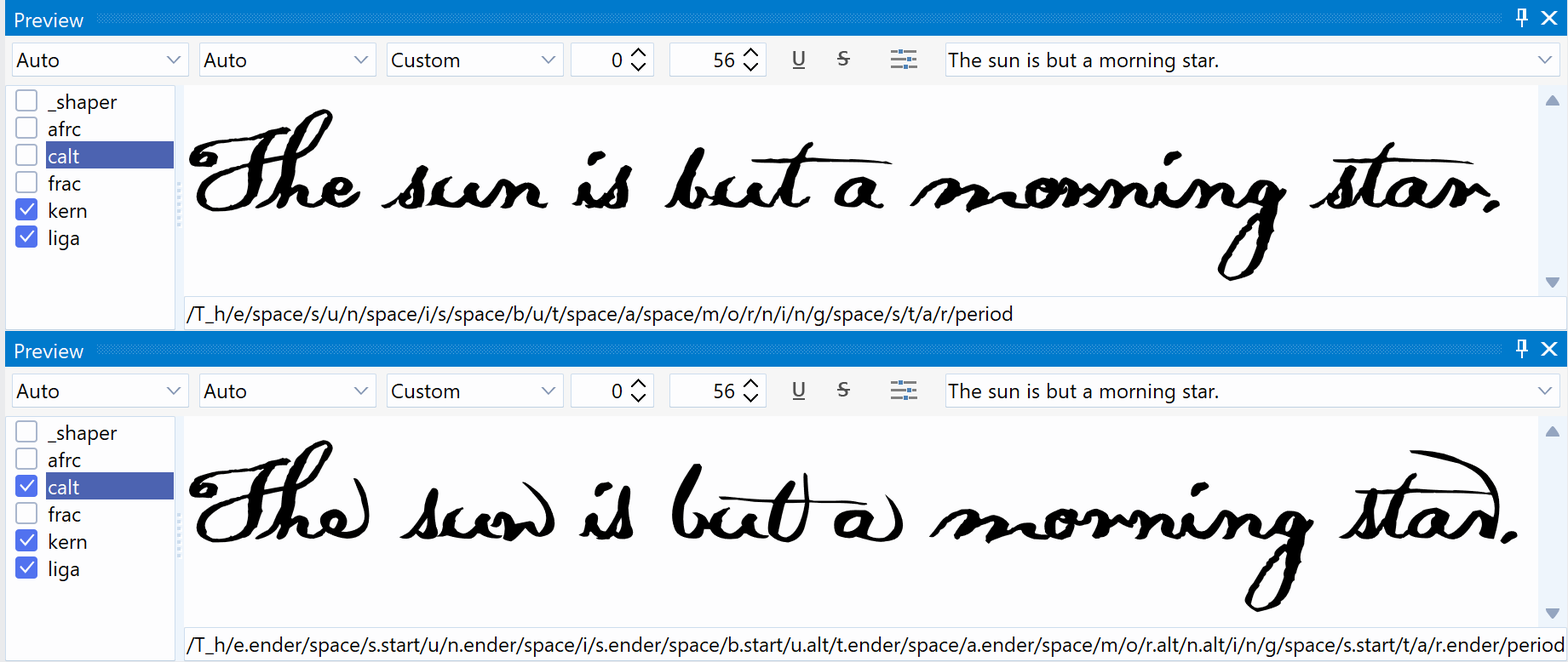
The same line with Contextual Alternates (calt) off and on. Start forms, finishing strokes and high joins appear automatically; the glyph names under the preview show which alternates were used.
How connecting handwriting works
A connecting script has three problems a single set of glyphs can't solve:
- Word starts. A joining letter has a lead-in stroke that comes from the previous letter. At the start of a word there is no previous letter, so the stroke dangles.
- Word ends. At the end of a word the hand lifts with a finishing stroke, a curl or a flourish, which would get in the way in the middle of a word.
- High joins. Letters such as o, v, w, b and r don't leave the letter at the baseline but at the x-height. The next letter has to pick the stroke up there; with its normal baseline lead-in it runs into the previous letter.
Each problem gets its own kind of alternate:
| Problem | Alternate | In Thoreau's Hand |
|---|---|---|
| Word start | start form, without lead-in | b.start, s.start, t.start, w.start |
| Word end | end form, with a finishing stroke | a.ender, n.ender, s.ender, … (13 letters) |
| High join | join alternate, entering at the x-height | n.alt, r.alt, v.alt, … (7 letters) |
Draw the default glyph as the joining form. The plain a, n or s should be the shape a letter has in the middle of a word, with its entry and exit strokes. Then text still joins in an application that doesn't apply contextual alternates, and the alternates only polish the edges. Microsoft Word, for one, applies them only when the user switches them on.

Why join alternates exist: after o, the default n (left) collides with the o's exit stroke; n.alt (right) enters at the x-height and joins smoothly. Type both pairs with the Text Tool to draw the alternate in context.
Step 1: Draw the alternates
Create each alternate as a new glyph, starting from a copy of the default glyph so the stroke weight and rhythm stay the same. Give every kind of alternate its own suffix. This font uses .start, .ender and .alt; any consistent suffix works, as long as you use it everywhere.
Draw the alternates in context, not in isolation. Open the glyph, choose the Text Tool in the glyph editor and type the neighbours around it. You can type glyphs by name with a slash, for example /o/n.alt. To see exactly the glyphs you typed, untick calt in the Preview panel; with calt on, the editor shows the text the way the font will substitute it.
A few rules keep the joins clean:
- Keep the connection points identical. Every form that leaves at the baseline must leave at the same height and angle, and every form that enters there must arrive the same way. The same goes for the x-height joins.
- Start forms remove the lead-in stroke but keep the letter's left side bearing sensible, so the first letter doesn't stick to the space before it.
- End forms often need a wider advance width for the finishing stroke.
- Alternates don't need code points. Leave them unencoded; the
caltfeature reaches them by glyph name. (Thoreau's Hand also maps its alternates to Private Use code points such as U+F230, so they can be typed by hand in applications without OpenType support. It's optional, and most designers leave it out: text typed with Private Use characters can't be searched or spell-checked.)
To review a set of alternates, open Glyphs > Suffixes in the categories panel of the Font Overview: FontCreator groups glyphs by the suffix after the period.

Suffixes in the categories panel: the 13 end forms of Thoreau's Hand. The same branch lists the .start and .alt glyphs.
Step 2: Decide what counts as a word
Every rule depends on one question: is the neighbour a letter that joins, or the edge of a word? Answer it with one glyph class that holds every glyph that joins:
- all lowercase and uppercase letters (if your capitals connect),
- all accented letters, so that a word like café isn't cut in two at the é,
- all ligatures, such as
fiort_t, - all alternates themselves. The rules run one after the other, and by the time a later rule looks at a neighbour, that neighbour may already be
r.altort.start. If the alternate isn't in the class, the rule sees the edge of a word.
Anything outside the class (spaces, punctuation, symbols) ends a word.
Step 3: Write the calt feature
Open the OpenType Designer (Font > OpenType Designer) and click Code Editor… at the bottom. The feature needs two kinds of lookups:
- Substitution lookups that only say which glyph becomes which (
sub n by n.alt;). They list only the letters that actually have that alternate; every other glyph passes through unchanged. They are not added to a feature directly. - Context lookups inside
caltthat say where a substitution lookup applies, using the class from step 2.
Here is the code for word starts, word ends and the joins after o and r, with the glyph names of Thoreau's Hand:
languagesystem DFLT dflt;
languagesystem latn dflt;

# Every glyph that joins a neighbour: letters, accented letters, ligatures
# and all alternates. A glyph outside this class ends a word.
@Connecting = [A-Z a-z ff fi fl b_b t_t l_l.liga s_s.liga oo
               a.ender c.ender d.ender e.ender f.ender h.ender k.ender l.ender
               n.ender r.ender s.ender t.ender u.ender
               b.start s.start t.start w.start
               i.alt n.alt r.alt s.alt t.alt u.alt v.alt];

# Letters (and their alternates) that end with a high exit stroke.
@o_forms = [o oo];
@r_forms = [r r.alt r.ender];

lookup StartForms {
    sub b by b.start; sub s by s.start; sub t by t.start; sub w by w.start;
} StartForms;

lookup EnderForms {
    sub a by a.ender; sub c by c.ender; sub d by d.ender; sub e by e.ender;
    sub f by f.ender; sub h by h.ender; sub k by k.ender; sub l by l.ender;
    sub n by n.ender; sub r by r.ender; sub s by s.ender; sub t by t.ender;
    sub u by u.ender;
} EnderForms;

lookup AltAfter_o {
    sub n by n.alt; sub r by r.alt; sub s by s.alt; sub t by t.alt; sub v by v.alt;
} AltAfter_o;

lookup AltAfter_r {
    sub n by n.alt; sub s by s.alt; sub v by v.alt;
} AltAfter_r;

feature calt {
    lookup WordStart {
        ignore sub @Connecting @Connecting';
        sub @Connecting' lookup StartForms;
    } WordStart;

    lookup WordEnd {
        ignore sub @Connecting' @Connecting;
        sub @Connecting' lookup EnderForms;
    } WordEnd;

    lookup After_o {
        sub @o_forms @Connecting' lookup AltAfter_o;
    } After_o;

    lookup After_r {
        sub @r_forms @Connecting' lookup AltAfter_r;
    } After_r;
} calt;
In your own font, add the accented letters and all ligatures to @Connecting, and their accented counterparts to classes such as @o_forms (ograve, oacute, …).
How the rules read:
- WordStart: the marked glyph (
') is skipped when a joining glyph comes before it (ignore); otherwise it gets its start form. A letter with no start form passes throughStartFormsunchanged. - WordEnd: the same, mirrored: no joining glyph after it means it is the last letter. A one-letter word such as a gets its end form too.
- After_o: a glyph that follows an o gets its join alternate. The full Thoreau's Hand has one such lookup for each letter whose exit needs a different entry in the next letter (after a, b, i, o, r, v and w), plus one that looks ahead instead of back: an i gets
i.altwhen a t follows.
Lookup order matters. Lookups in a feature run from top to bottom, and each one sees the result of the ones before it:
- WordStart and WordEnd come first, so a word-final n after an o stays
n.ender:AltAfter_ohas no entry forn.ender. - In morning,
After_oturns the r intor.alt, andAfter_rthen seesr.altbefore the n and turns it inton.alt. That chain only works becauser.altis in@r_forms.
Click Compile to check the code, then OK.

The calt feature in the Code Editor. WordStart and WordEnd come first; the After_ lookups for the high joins follow.
Step 4: Check a rule in the Visual Designer
Back in the OpenType Designer, every lookup you wrote appears in the tree under ContextualAlternates (calt), in the order in which it runs. Select a lookup to see its rule on the Rules tab: the Backtrack column holds the glyphs before the marked glyph, Input the glyph that changes, Lookahead the glyphs after it, and Substitution Tables the lookup that does the substitution. To change the order, use the up and down arrows in the toolbar above the tree.
Type a test word in the preview at the bottom. The line under it lists the glyphs the text turned into, so you can see at once whether a rule did its job.

The After_o rule: after any glyph in @o_forms, the next joining glyph goes through AltAfter_o. The preview of morning confirms it: r.alt after the o, and n.alt after the r.
Step 5: Test it
In FontCreator. In the Preview panel, set the feature list to Custom and tick and untick calt to compare. Test real sentences, not just single words: words with doubled letters, one-letter words, words before punctuation, capitalized words and accented words.
Step through the lookups (Professional). Click the Proofing button in the toolbar above the OpenType Designer's tree to follow the text one lookup at a time with Lookup and Item. For each lookup you see where a rule matched and what it substituted. A rule can match without changing anything: in morning, After_i matches the n after the i, but Alt_s has no entry for n, so the n stays. The Proofing window also shows that kerning runs after calt and is applied to the alternates, so kern pairs like o r.alt need values too.

Proofing morning: After_o turns r into r.alt, then After_r sees r.alt and turns n into n.alt. Kerning runs afterwards, on the alternates.
In other applications. Export the font and install it:
- Adobe applications and web browsers apply contextual alternates by default.
- Microsoft Word doesn't. Select the text, open Font (Ctrl+D), go to the Advanced tab and tick Use Contextual Alternates. If your font uses ligatures as well (as Thoreau's Hand does for doubled letters), set Ligatures to Standard Only (or higher) there too.
Doubled letters and variation
Two identical letters next to each other give a typeset font away. Thoreau's Hand solves this with ligatures in the liga feature: ll, tt, ss, pp, ee and oo each have a glyph that looks like the two letters were written in one go. Add these ligatures to the class from step 2, so the rules treat them like any other letter.
Another approach is to draw two or more variants of common letters and let a final calt lookup alternate between them. That gives a livelier texture, but every variant multiplies the number of glyphs, and every variant needs the same start, end and join alternates. Start with start forms, end forms and join alternates; add variants only when the text still looks too regular.
Troubleshooting
| Symptom | Likely cause | Fix |
|---|---|---|
| Nothing changes in Word | Contextual alternates are off in Word | Font > Advanced > tick Use Contextual Alternates |
| The first letter keeps its lead-in stroke | The letter has no start form, or isn't in StartForms | Draw x.start and add sub x by x.start; |
| A letter in the middle of a word gets a start or end form | A neighbour isn't in @Connecting (an accented letter, ligature or alternate) | Add the missing glyph to @Connecting |
| Accented letters don't get end forms | Only the base letters are in EnderForms | Draw eacute.ender and the like, and add them to the lookup |
| A letter after o, v or w collides with it | No join alternate, or no After_ rule for that letter | Draw the .alt form and add it to the right substitution lookup |
A chain stops halfway (r.alt but no n.alt after it) | The alternate is missing from the class the next rule looks back at | Add r.alt to @r_forms |
| A join looks right in one word but not in another | Lookup order | Keep WordStart and WordEnd first; check the order in the tree |
| Letters join at the wrong height | Entry and exit points differ between forms | Align them across the default, .start, .ender and .alt forms |
Frequently asked questions
What is the calt feature?
Contextual Alternates: an OpenType feature that replaces glyphs depending on the glyphs around them. Most applications apply it by default; Microsoft Word only when the user switches it on.
Why calt and not init, medi and fina?
The positional features init, medi and fina are applied automatically only for scripts such as Arabic and Syriac. For Latin text, applications ignore them unless the user turns them on, so a Latin handwriting font uses calt. FontCreator's Generate and Update can create init, medi and fina, but for a Latin script font you write calt yourself.
How many alternates do I need?
Fewer than you might think. Thoreau's Hand has 4 start forms, 13 end forms and 7 join alternates, and that's enough for natural-looking text. Start with the letters that occur most often at word starts and ends, and with the letters that follow a high exit.
Should the alternates have Unicode code points?
No. The calt feature finds them by glyph name. Mapping them to Private Use code points is an old trick to let users pick them by hand; it makes text hard to search and spell-check.
Do I need FontCreator Professional?
No. The OpenType Designer, its Visual Designer and the Code Editor are in every edition. The Proofing window, which follows the text one lookup at a time, is part of Professional.
Screenshots use Thoreau's Hand by Ron Koster (psymon.com), licensed under the SIL Open Font License 1.1. Class and lookup names were changed for readability.
What to read next
- Monoline & Stroke Fonts: Design from a Skeleton — design connecting monoline scripts from a centerline, then export.
- Enrich Your Fonts with OpenType Features — ligatures, stylistic sets, and the other features to layer on next.
- Test and Validate — confirm the contextual alternates behave the same across apps before you ship.
