FontCreator Tutorials
Latin Diacritical Marks – Accents
This article was originally published November 28, 2018. Updated August 20, 2022.
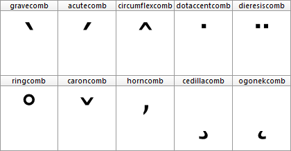
A diacritic is a mark used to create composite characters. These diacritical marks mostly appear above or below a letter, but they can also be within a base character, and even between two letters. Diacritics are used in several scripts for different reasons. In Latin they are mainly used to provide pronunciation guidance. Some of these marks are also known as accents (e.g. acute, grave, circumflex, and tilde).
Base characters have an advance width as they define the horizontal space used to show the outline. Marks are usually non-spacing, as they just belong to the base character without changing the space occupied by the combination. In left-to-right scripts (like Latin) such nonspacing combining marks are usually placed before the left side bearing (thus the glyph has a negative LSB), in order to combine with the preceding letter.

Precomposed Characters
At some point in designing a font you probably want to add precomposed characters (e.g. like Ccedilla, aacute, and edieresis). A pre-composed character is actually a combination of a base character and one or more mark characters which also has its own Unicode code-point. From a historical point of view, they were added to Unicode to ensure the standard did support conversion to and from other encoding standards which already included such precomposed characters.
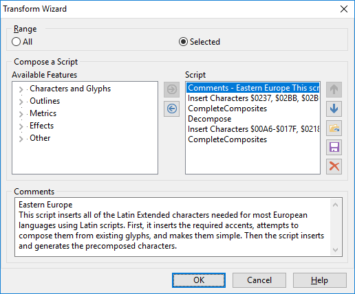
FontCreator (standard and professional edition) allows you to automatically add and generate such characters through the Insert Characters and Complete Composites features. You can also use the Glyph Transform feature which allows you to quickly add support for Eastern Europe, Greek Extended, and more. Obviously they work best after you have designed the base and mark characters.

Precomposed characters are not equal to composite glyphs, but they go along very well. A composite glyph relates to the way a glyph’s outline is stored within a font, as composite glyphs are made out of “soft links” to one or more other glyphs. The benefit of composite glyphs, is that when you make modifications to the base or mark glyph(s), the composite is automatically updated as well.
There are text processing engines (Illustrator?) that decompose precomposed characters, but it seems most text processing engines (Windows, Microsoft applications, Firefox, etc) perform Unicode normalization form C (canonical composition) to the character string. This will transform each base character plus combining mark character(s), to the canonical precomposed equivalent (if available in the font). For example, a + ◌̃ becomes ã, but only if ã is defined in the font.
If the font lacks support for a pre-composed character, it will just show the base and the mark(s) they way they are designed. In such case a mark might fit perfectly above the e and o but the mark might be too much to the right on a w and way too low on capital characters.
If you directly type a precomposed character that is not available in the font, either another font is used to display it, or you'll see the missing glyph (.notdef). So it remains important to include precomposed characters.
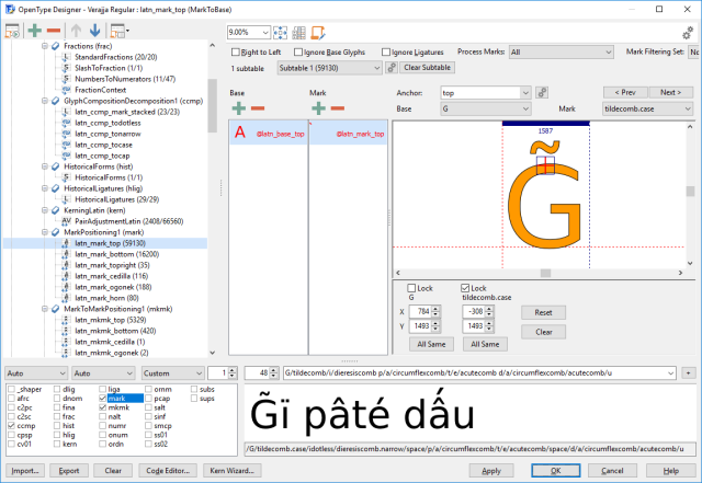
Many languages make use of base and mark combinations that are not available as precomposed characters in Unicode (for example g + ◌̃ -> g̃ and G + ◌̃ -> G̃ as used in Paraguayan Guarani language). And as stated earlier, including precomposed characters to Unicode was more or less a legacy mechanism, the Unicode consortium has no intentions to add more of them. Fortunately people can type them as a base character followed by the combining mark character(s). But as noted earlier the marks won't always be positioned correctly this way. So how can we fix that?
OpenType Positioning Features
With OpenType font technology there is another way to position diacritics to base characters by using OpenType positioning features. The specific features are mark to base (mark) and mark to mark (mkmk). The mark feature positions mark glyphs in relation to a base (or a ligature) glyph. The mkmk feature positions mark glyphs in relation to another mark glyph, so you can stack them. Both these features make use of attachment points, also known as anchors.
Within FontCreator we can easily add OpenType feature code through the OpenType Designer. It can be done visually, or by writing feature code.
###
# OpenType Layout feature definitions
# Format: OpenType Feature File Specification version 1.25.1
# Generated by: FontCreator

languagesystem DFLT dflt;

@marks = [dieresiscomb gravecomb acutecomb circumflexcomb caroncomb ringcomb tildecomb macroncomb];
@basetop = [A-C a-c];
@basemiddle = [D O d o];
@basebottom = [C c];

markClass cedillacomb <anchor -256 0> @bottom;

markClass strokeshortcomb <anchor -385 727> @middle;

markClass gravecomb <anchor -24 1038> @top;
markClass acutecomb <anchor -339 1038> @top;
markClass circumflexcomb <anchor -324 1038> @top;
markClass tildecomb <anchor -367 1038> @top;
markClass macroncomb <anchor -415 1038> @top;
markClass dieresiscomb <anchor -357 1038> @top;
markClass ringcomb <anchor -295 1038> @top;
markClass caroncomb <anchor -324 1038> @top;

feature mark { # Mark Positioning
    lookup MarkToBaseBottom { # GPOS lookup type MarkToBase
        pos base C <anchor 658 0> mark @bottom;
        pos base c <anchor 529 0> mark @bottom;
    } MarkToBaseBottom;

    lookup MarkToBaseMiddle { # GPOS lookup type MarkToBase
        pos base D <anchor 366 727> mark @middle;
        pos base O <anchor 661 727> mark @middle;
        pos base d <anchor 733 1269> mark @middle;
        pos base o <anchor 558 519> mark @middle;
    } MarkToBaseMiddle;

    lookup MarkToBaseTop { # GPOS lookup type MarkToBase
        pos base A <anchor 663 1454> mark @top;
        pos base B <anchor 652 1454> mark @top;
        pos base C <anchor 658 1454> mark @top;
        pos base a <anchor 540 1038> mark @top;
        pos base b <anchor 262 1454> mark @top;
        pos base c <anchor 549 1038> mark @top;
    } MarkToBaseTop;
} mark;
Writing such code is tedious, but can be useful. But you don't need it if you want anchor based features, as FontCreator can do all the hard work for you!
OpenType Feature Generation
The fastest way to add anchor based features to your font, is to automatically generate anchors and the use them to automatically generate the OpenType layout features. Your font needs combining marks. If your font misses them, you can add them by running the Eastern Europe transform script. If your font lacks anchors, just select all glyphs and select Complete Composites -> Anchor Based Reposition to add and position anchors for several Latin based characters.
In general for diacritic marks placed above a base glyph, base anchors are vertically positioned at the CapHeight for upper case and at the x-Height for lower case characters. Anchors for regular marks are vertically positioned at x-Height, with some exceptions like "k", and "t". For diacritic marks below a glyph (like dotbelow and cedilla), the anchor will be set at the baseline.
Altering the vertical position of the anchors is not recommended, it is far more convenient to move the outlines of your marks up or down. Holding down the SHIFT key while moving the anchor in the glyph edit window limits the movement to either horizontal or vertical. Or it's position can be set using the Anchors toolwindow.
Now go to the OpenType Designer, and click the tool bar item in the upper left corner, within this dialog, select Anchor Based Positioning, and click the OK button.

The OpenType features and lookups are now added to your font as shown above. You can type preview text to test your features. You can either type a letter or a slash followed by the glyph name of the letter.
Vietnamese Stacking Accents
If the font contains combined Vietnamese tone marks, ensure those glyphs use the correct glyph name convention. For example, if you've created a glyph which consist of circumflexcomb and gravecomb, then name that glyph circumflexcomb_gravecomb.
Diacritics to the Max
If you want to use different marks for upper case and lower case letters, do add a mark variant with a .case suffix (e.g. gravecomb.case), and vertically position its top anchor at CapHeight. The .case diacritics should be positioned correctly for uppercase glyphs, which will usually be well above the CapHeight.
Some diacritics are too wide to fit with narrow glyphs like i and j, and may collide with adjacent glyphs. If this causes difficulty with the legibility of the text, add a mark variant with a .narrow suffix for these exceptions.
A font with small capitals and/or petite capitals, might benefit from additional variant marks. For small capitals, use .smcp; for petite capitals, use .pcap. If you want to use marks for both small capitals and petite capitals, only add marks with a .cap suffix.
If you stick to the above naming conventions, the OpenType feature generator knows how to include the correct features and lookups for anchor based positioning.
After you've added variant marks, be sure to reapply Complete Composites -> Anchor Based Reposition to the affected composite glyphs.
Automatically Reposition Glyph Members
By default changes made to anchors are not propagated to the composites, so you need to reapply Complete Composites -> Anchor Based for these changes as well. This can be cumbersome, and you might even forget to manually do this after each change. To be sure your composites always are in sync with the anchors you can set the composite glyphs to Auto Attach, as available from the context menu.
Updated July 20, 2019 - added text about Vietnamese Stacking Accents
Updated August 20, 2022 - replaced OTLFD feature code by Adobe fea syntax